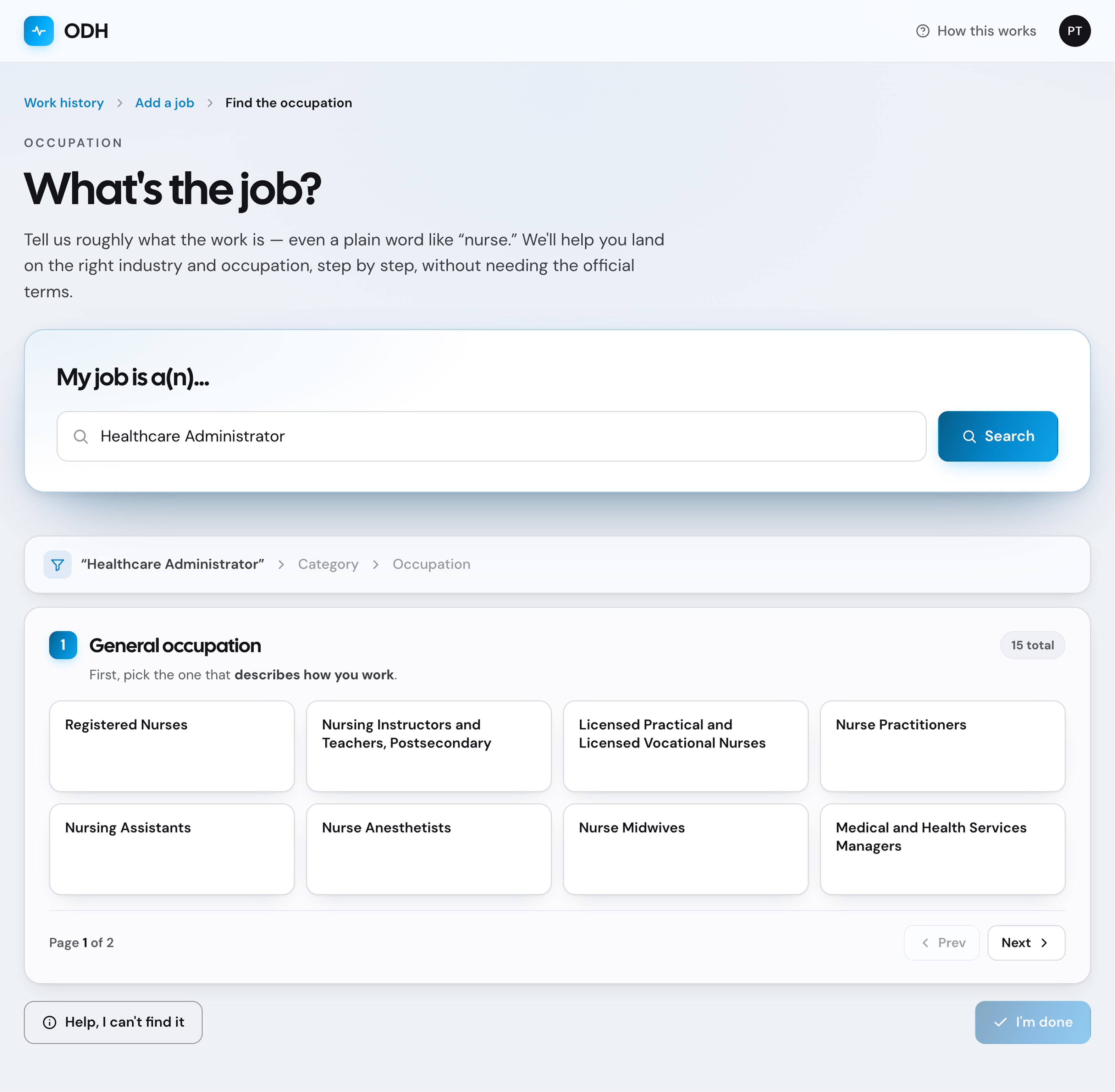
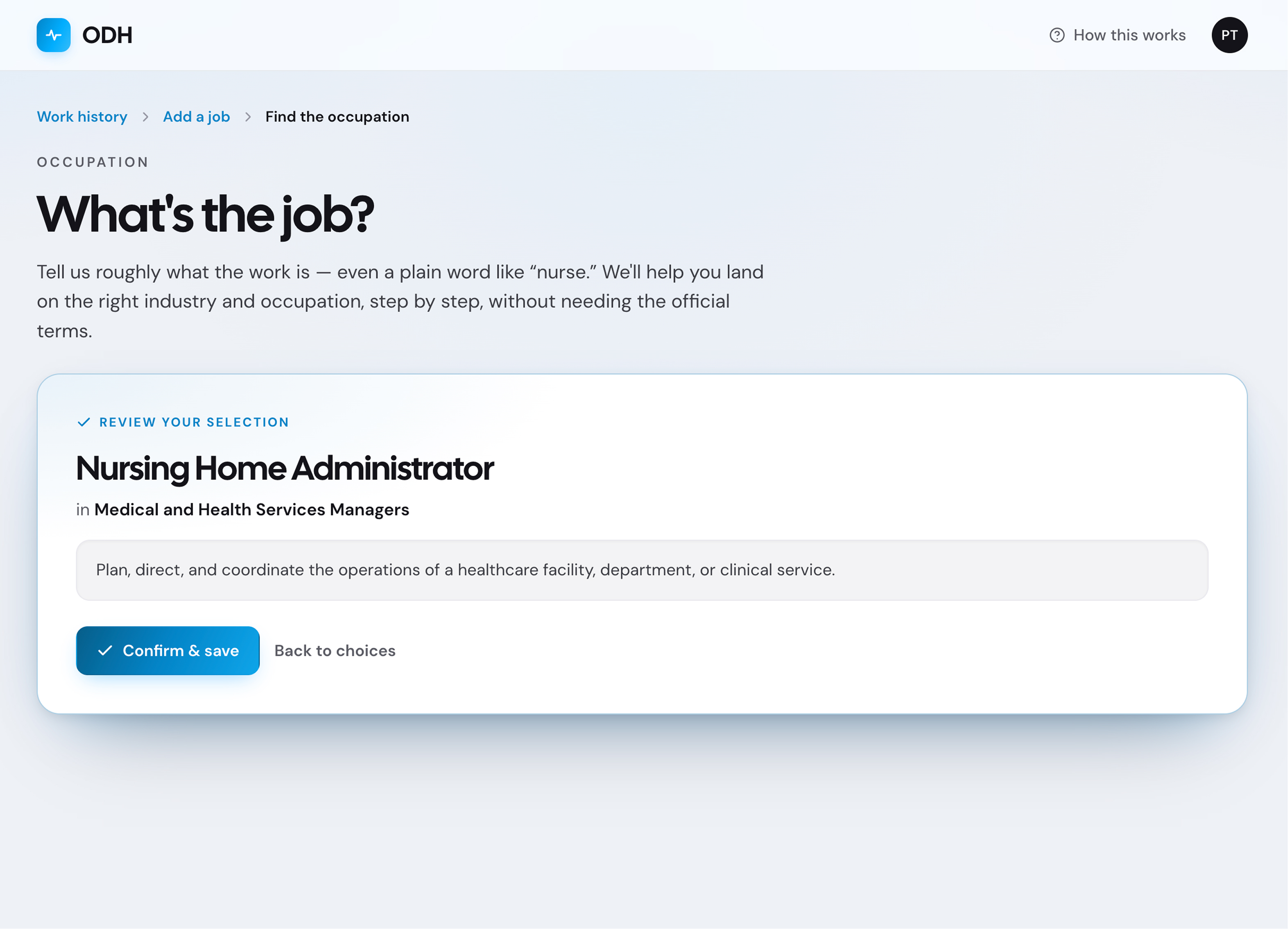
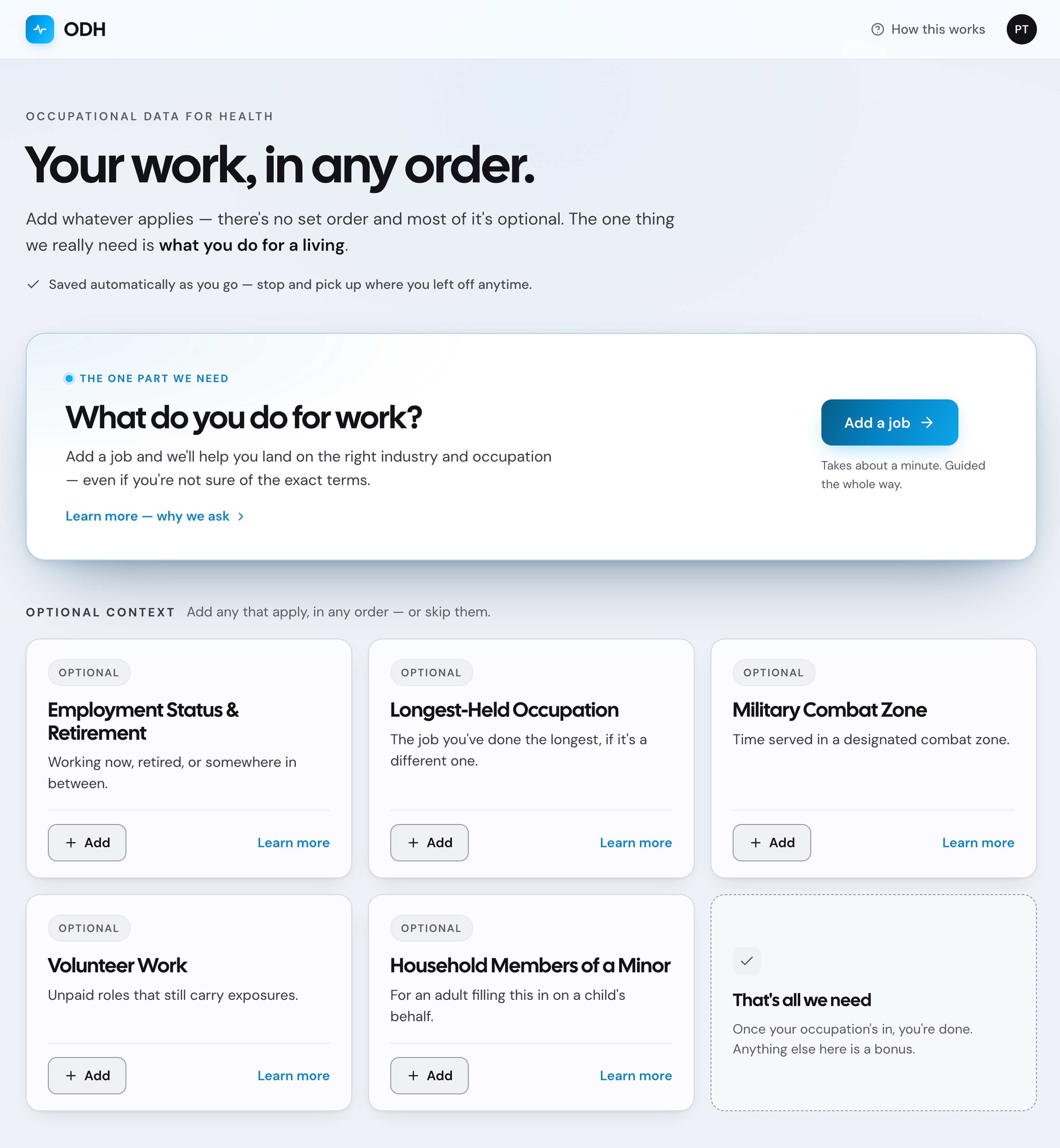
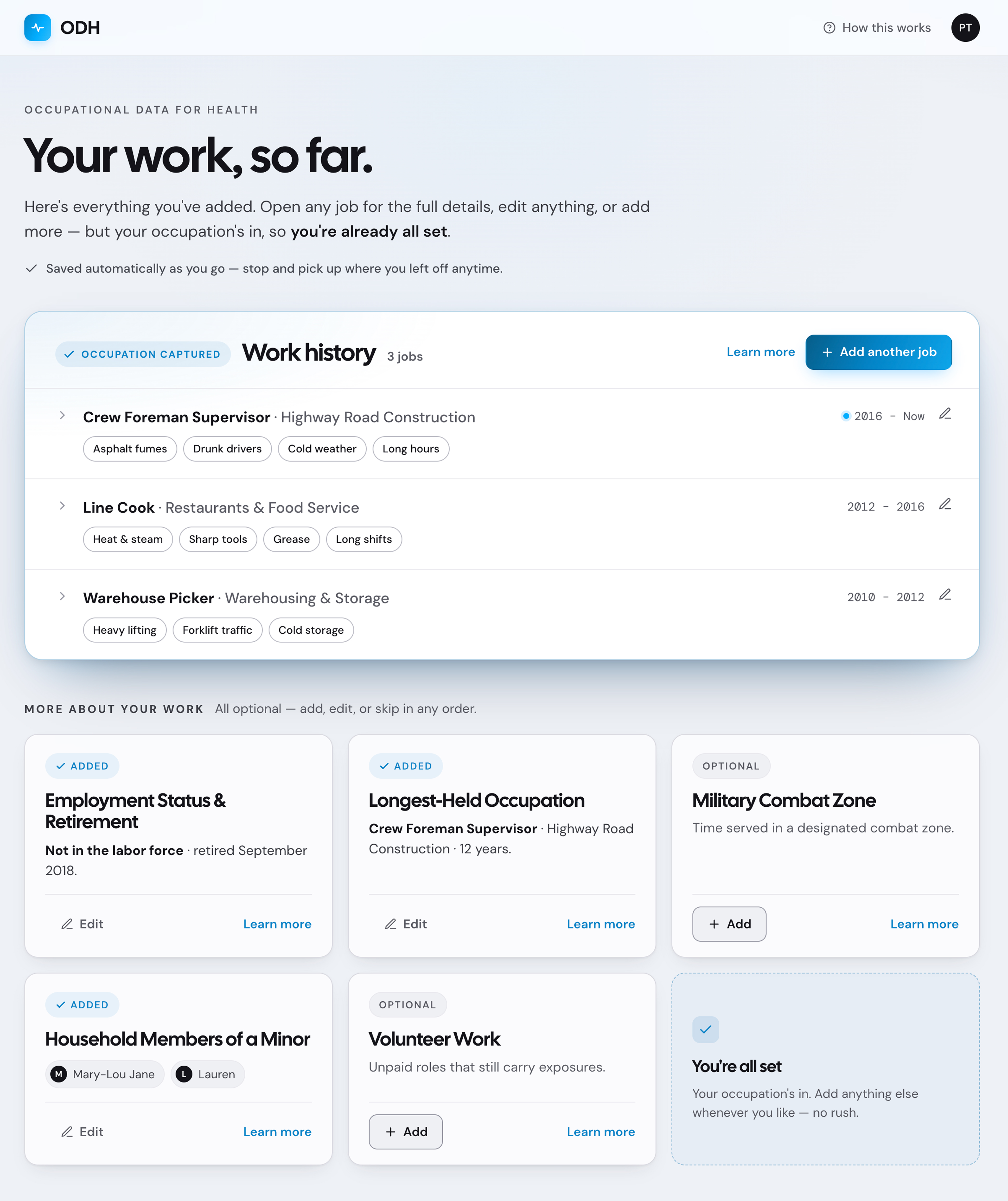
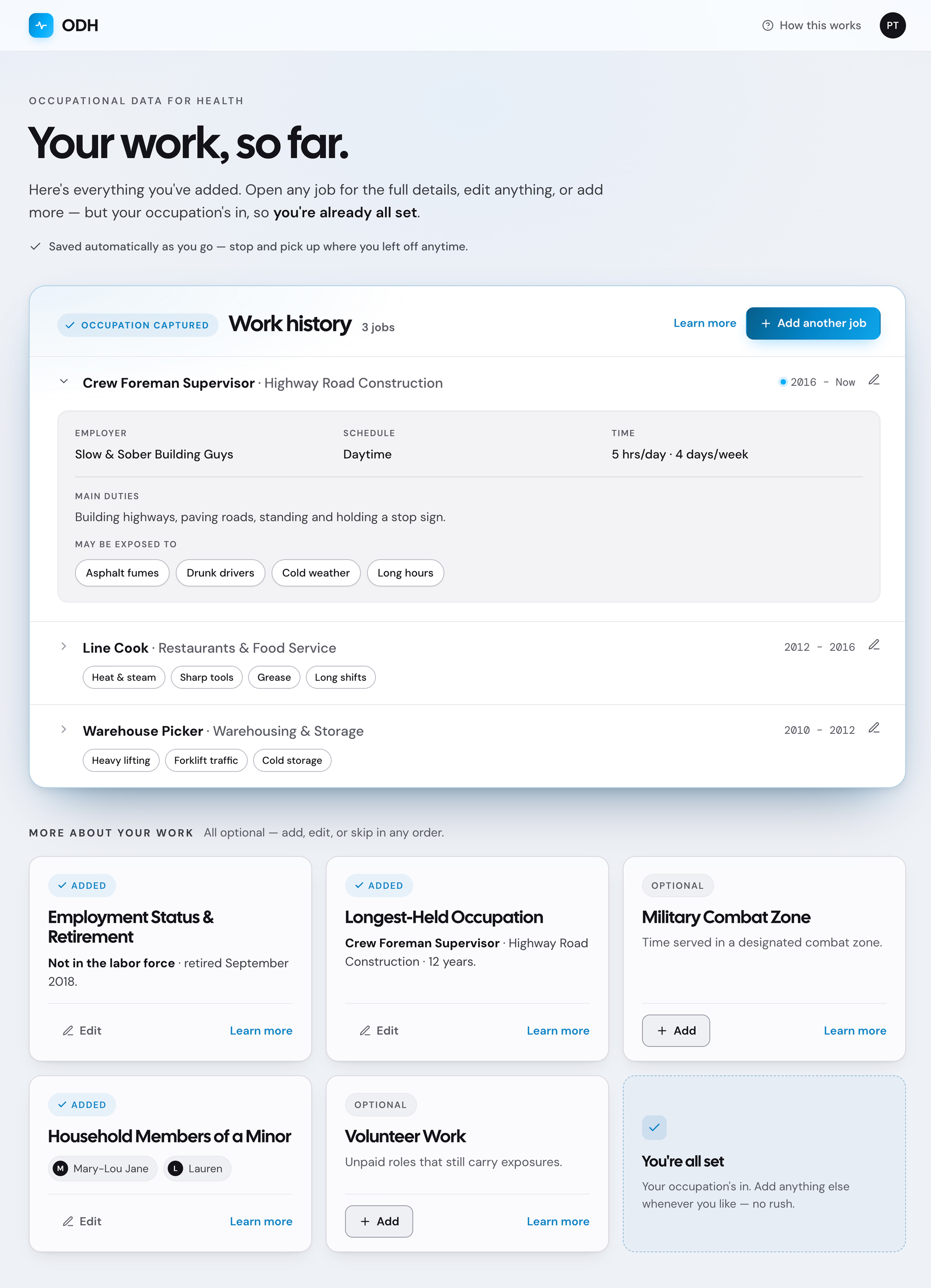
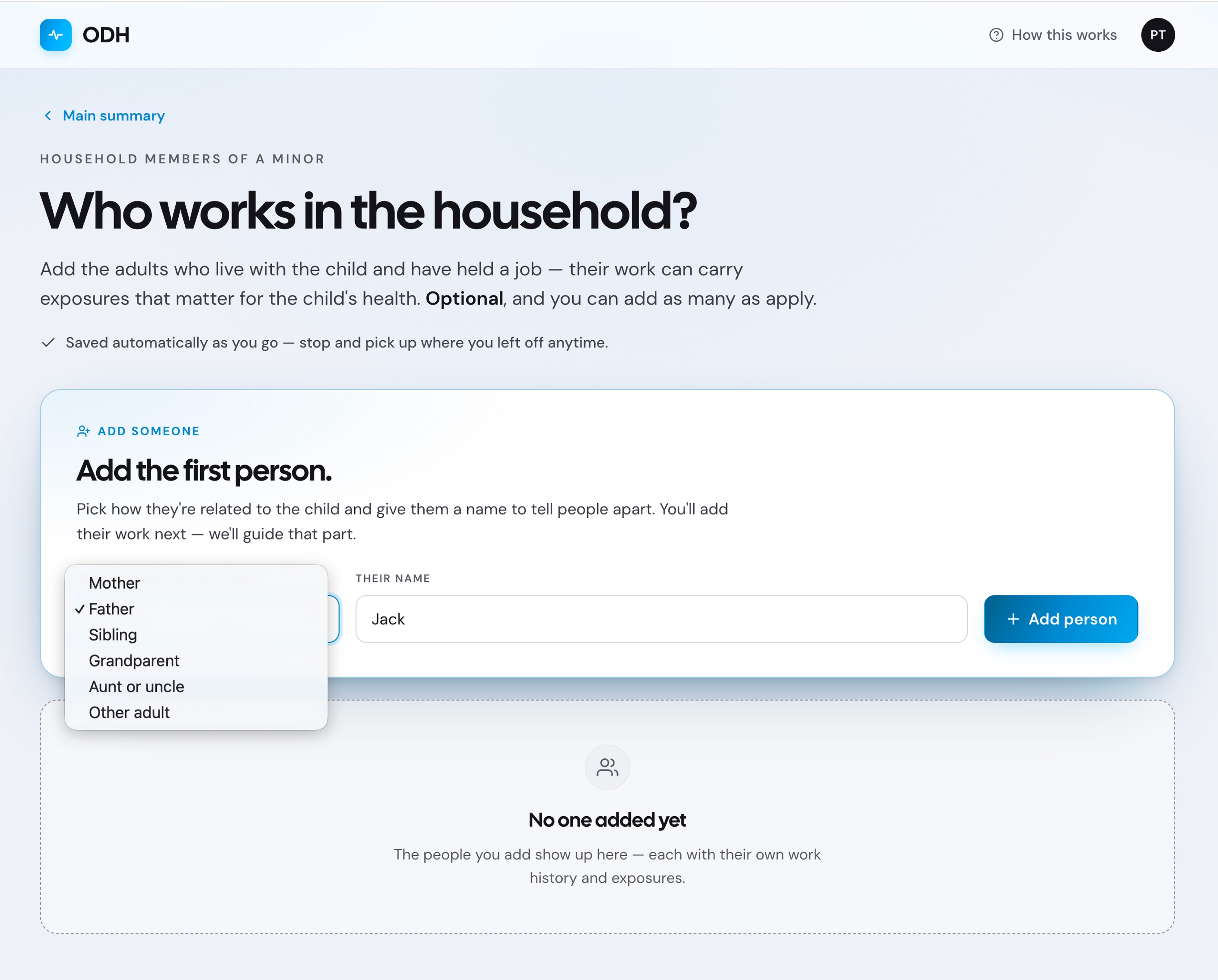
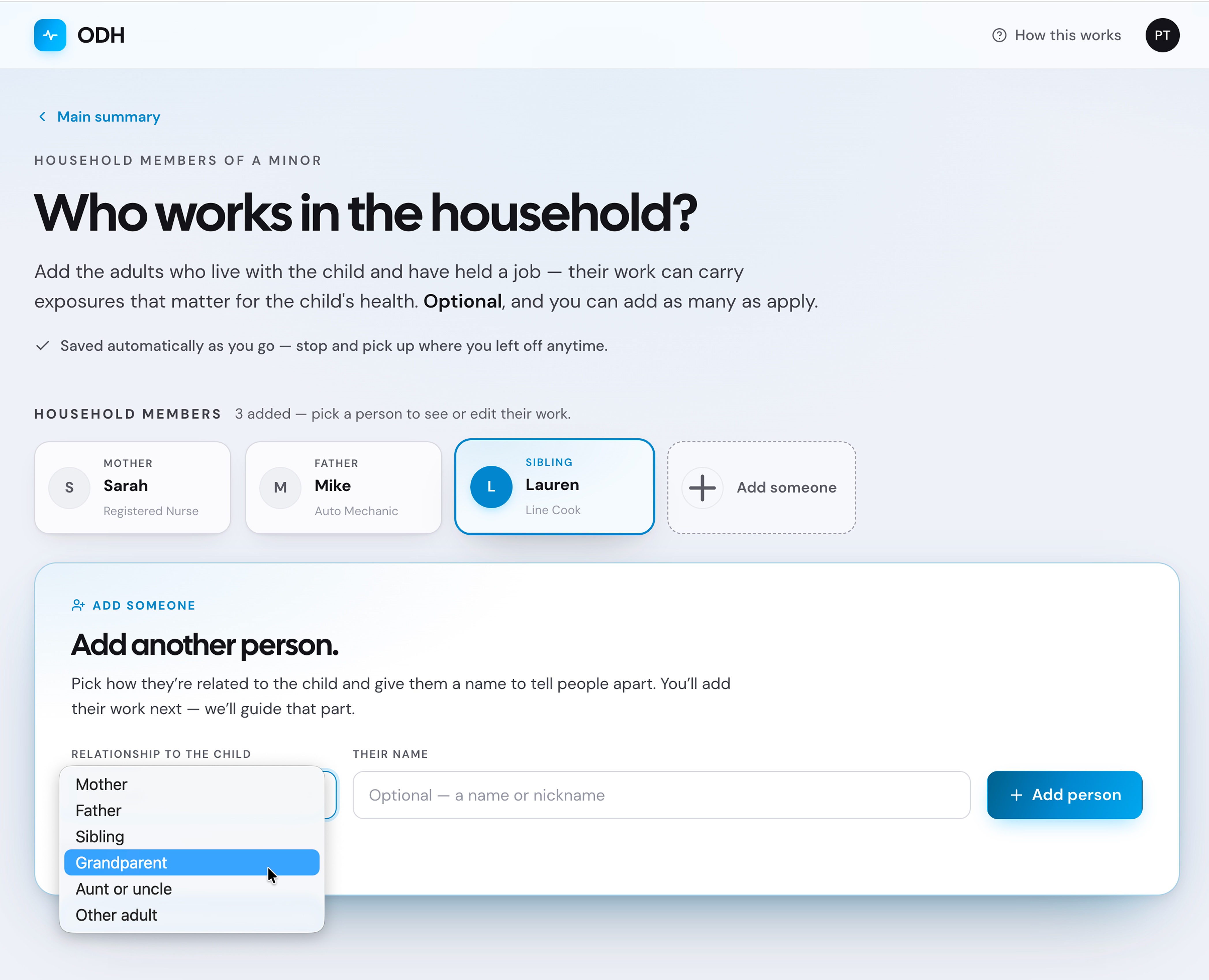
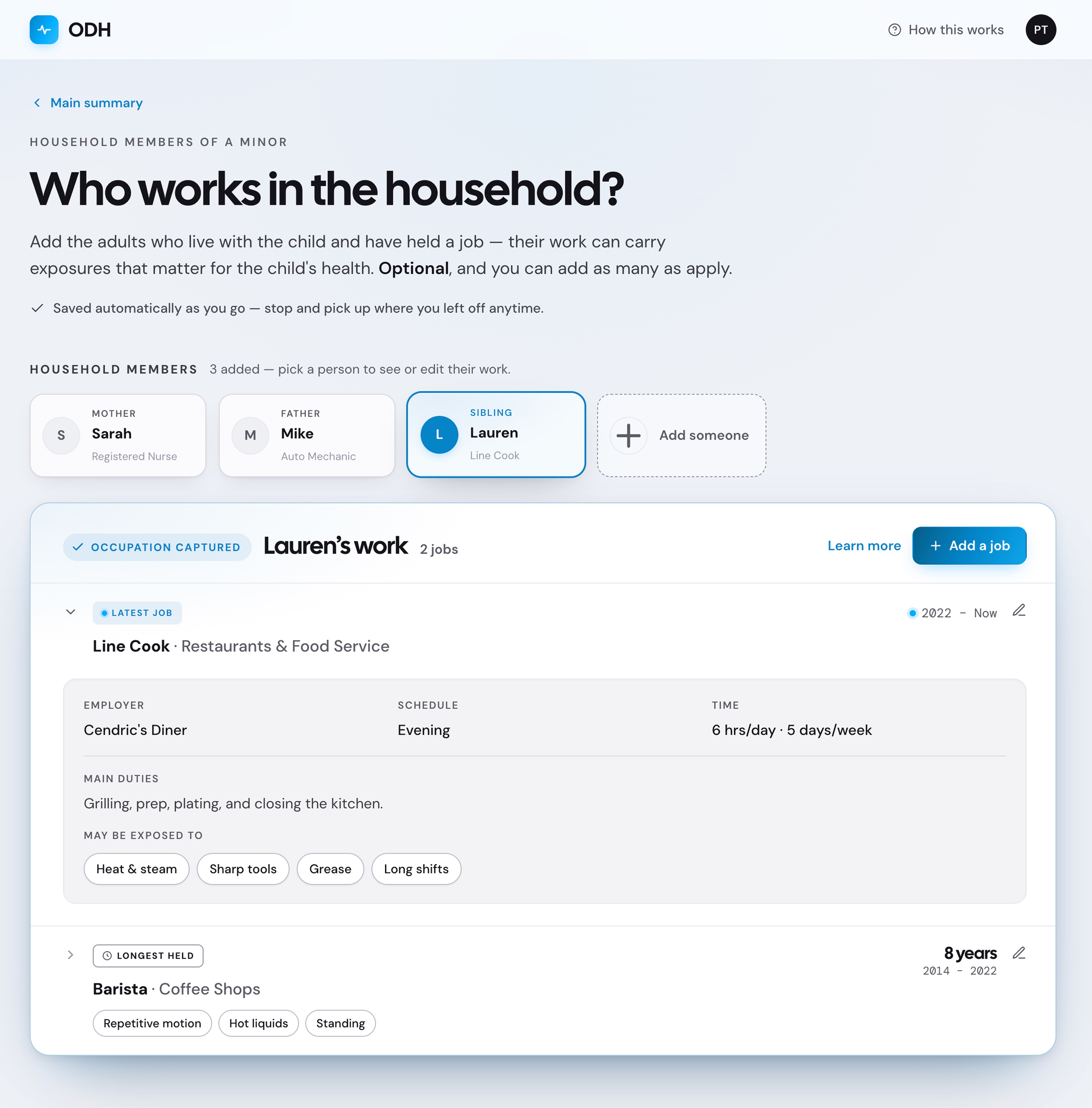
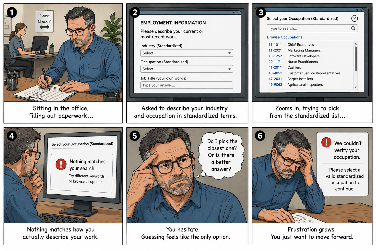
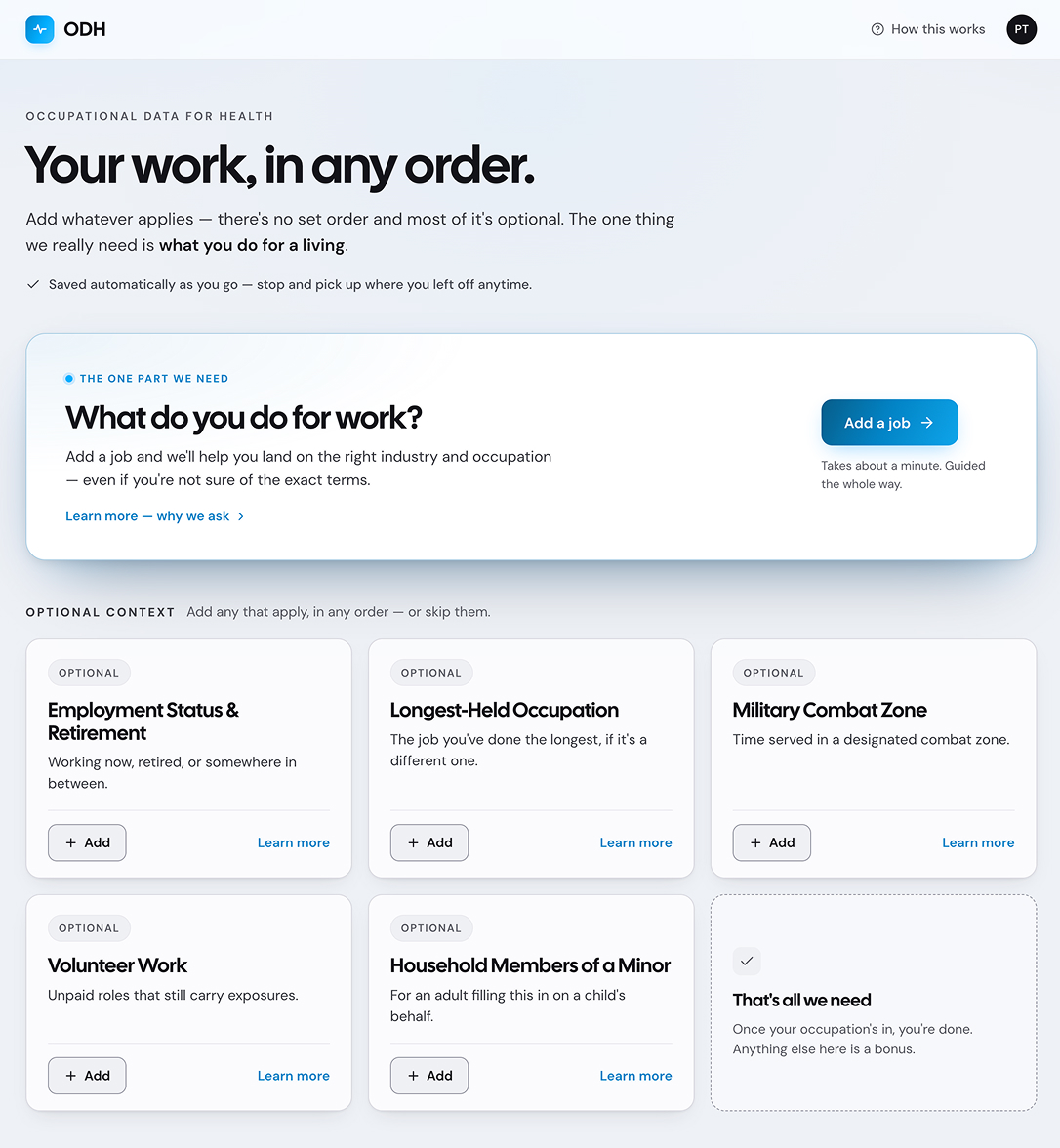
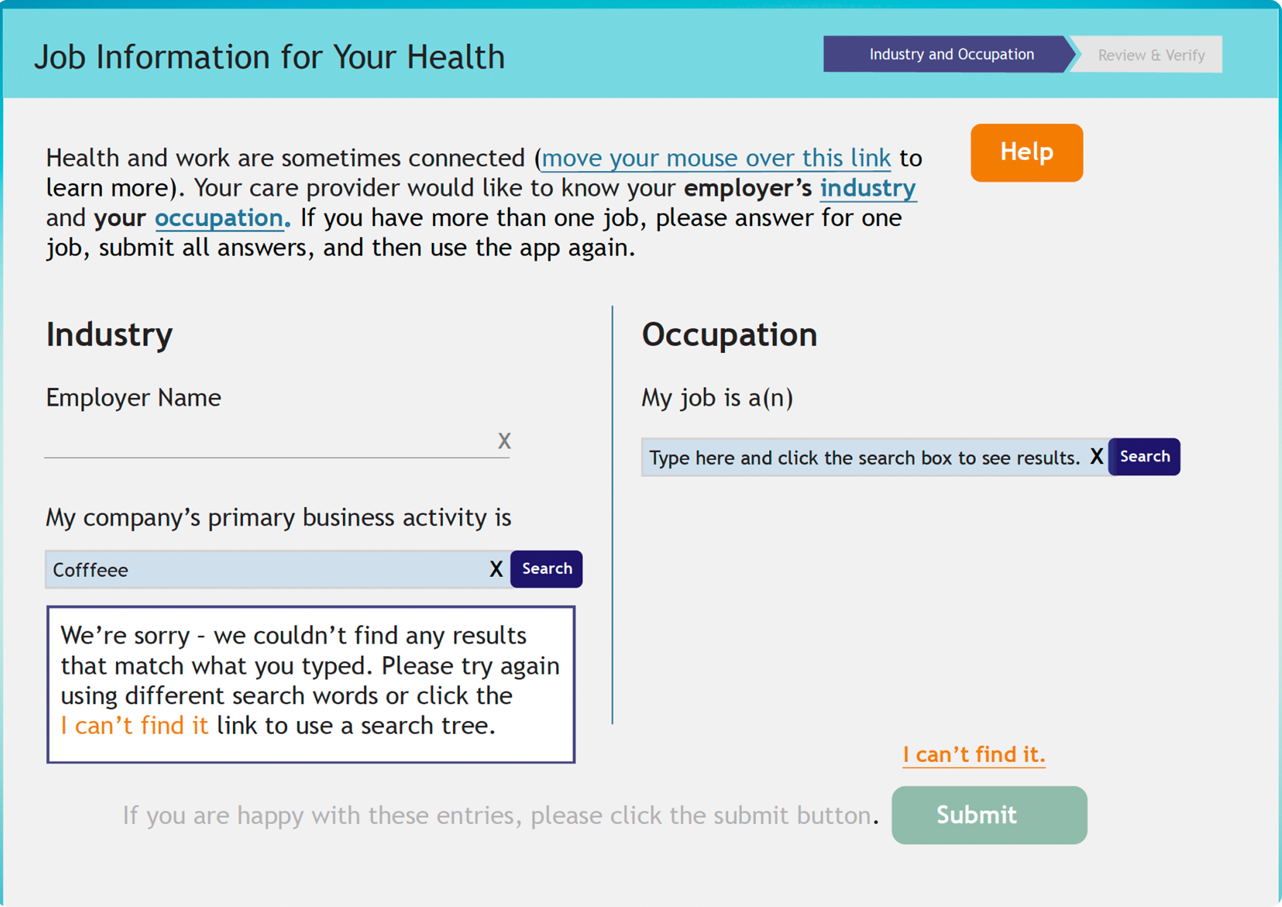
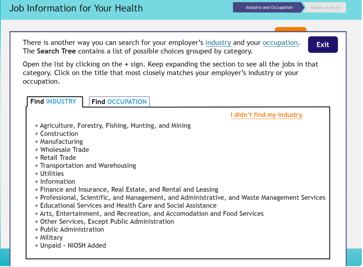
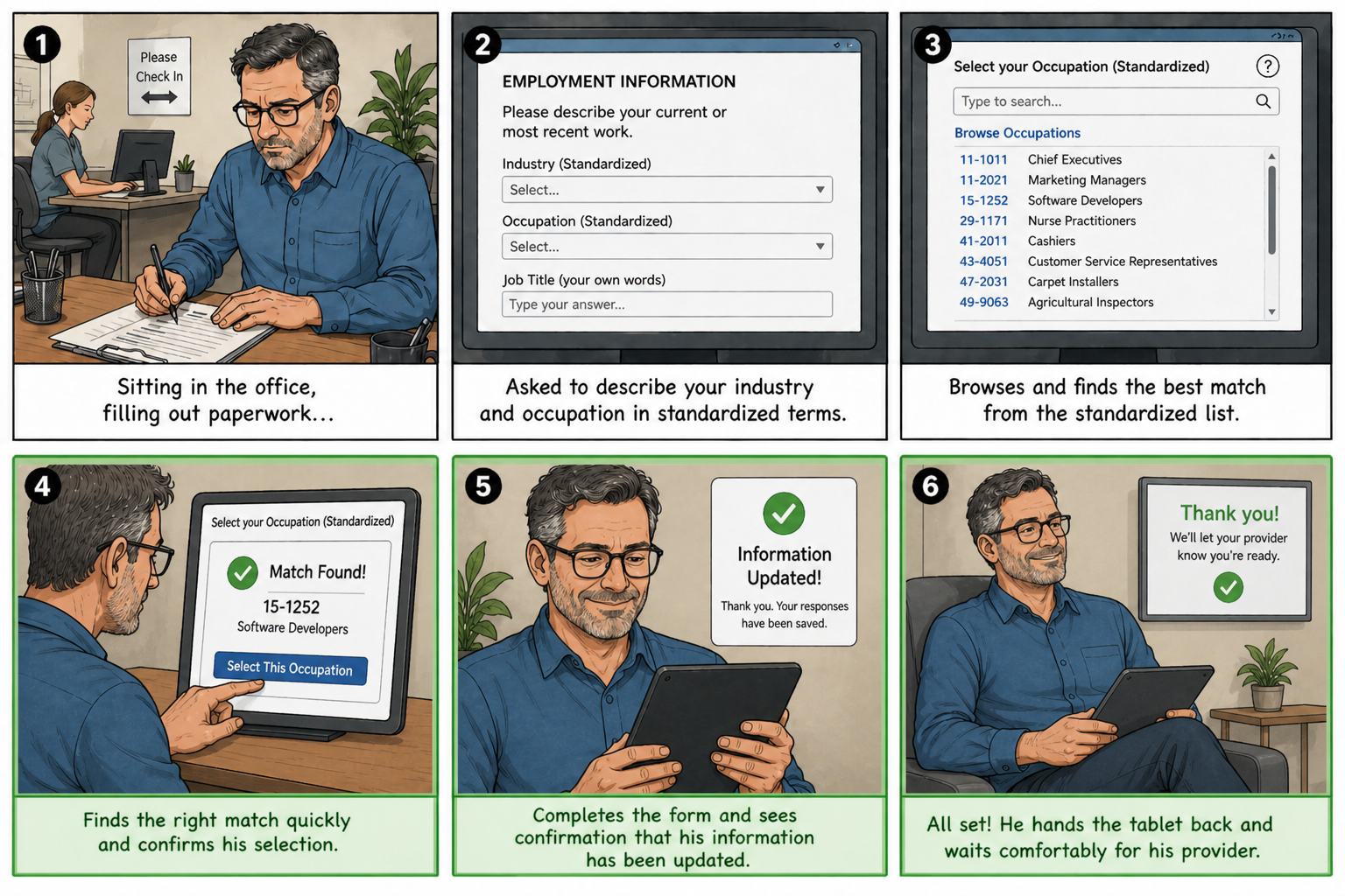
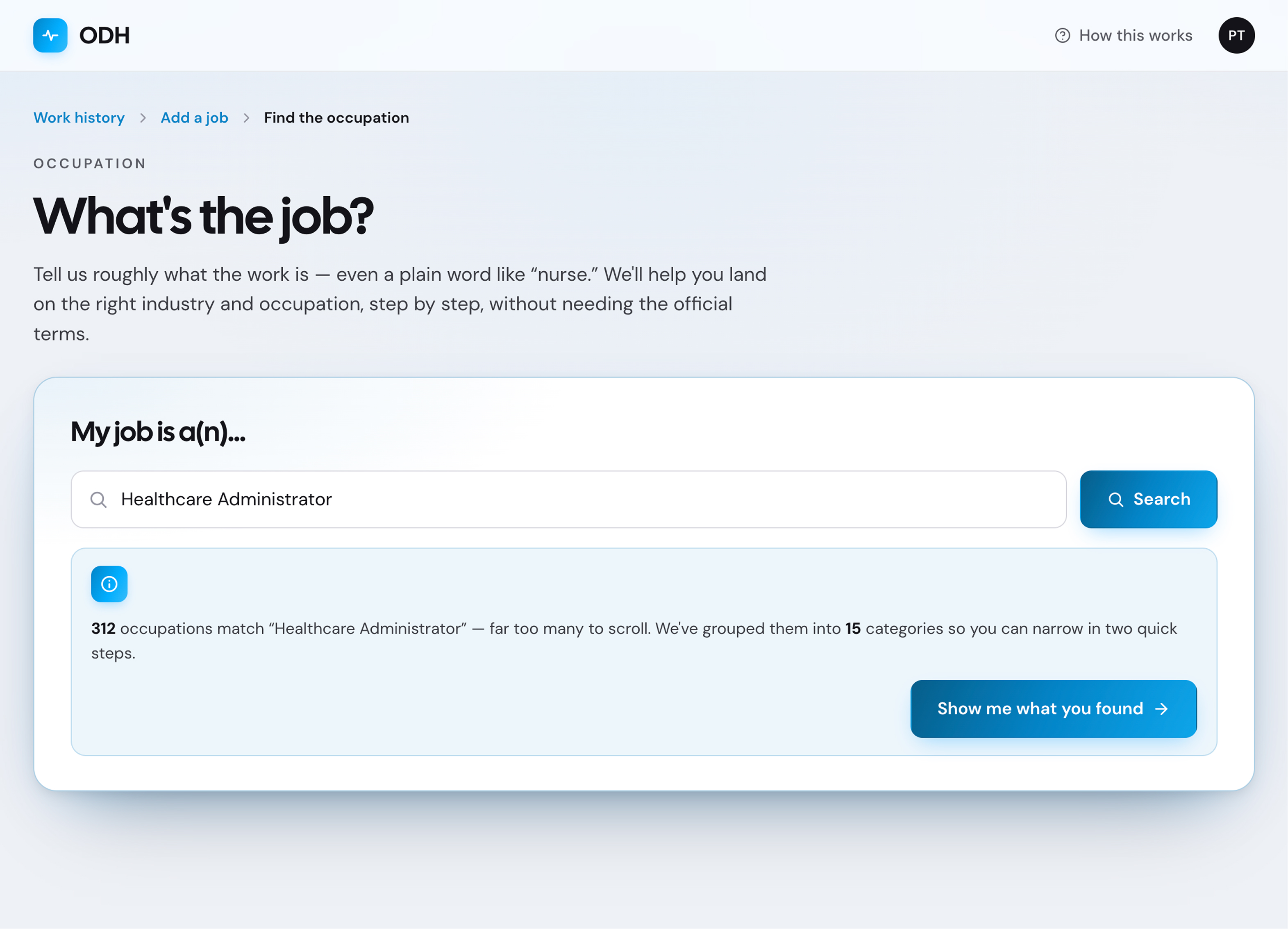
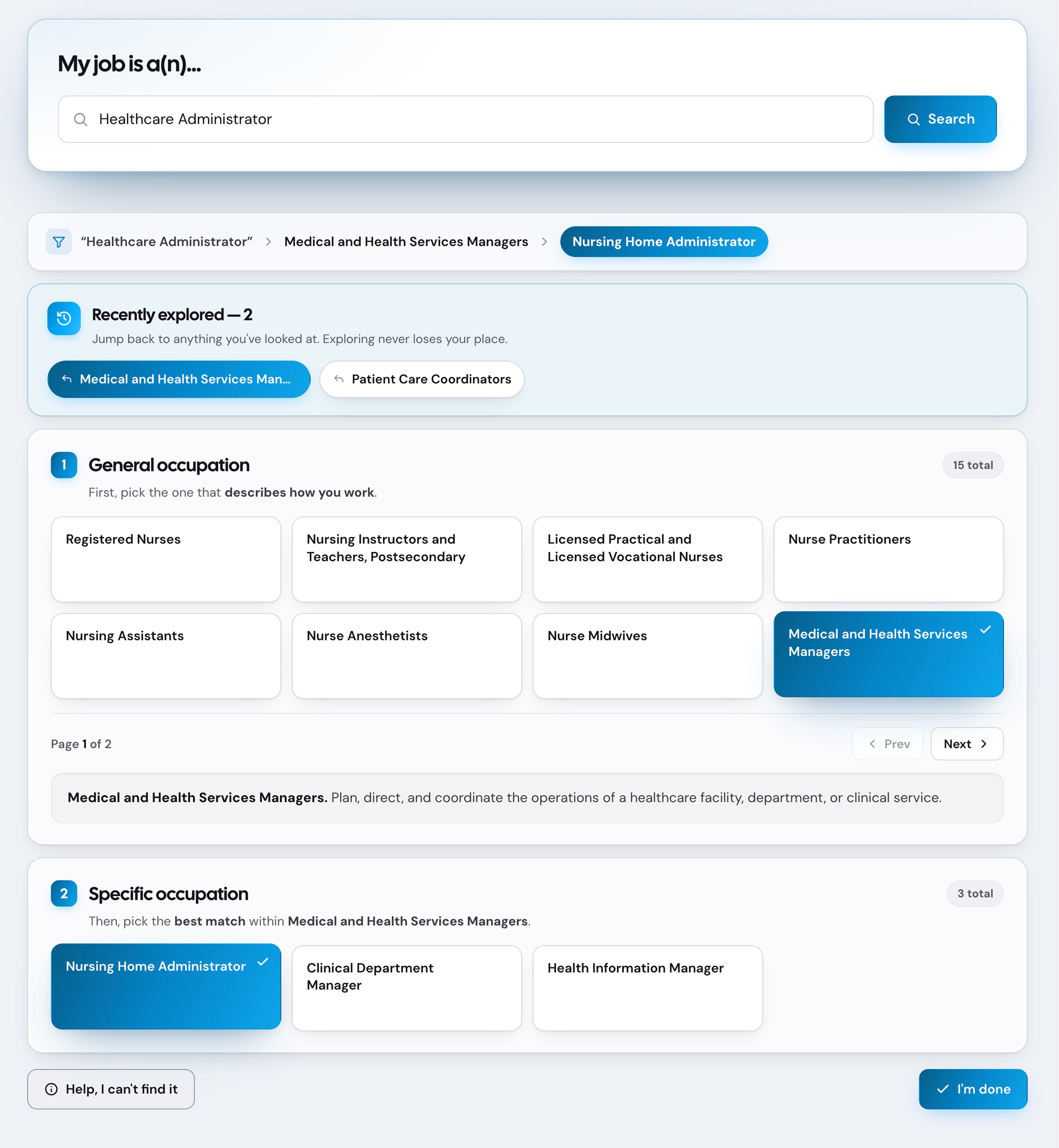
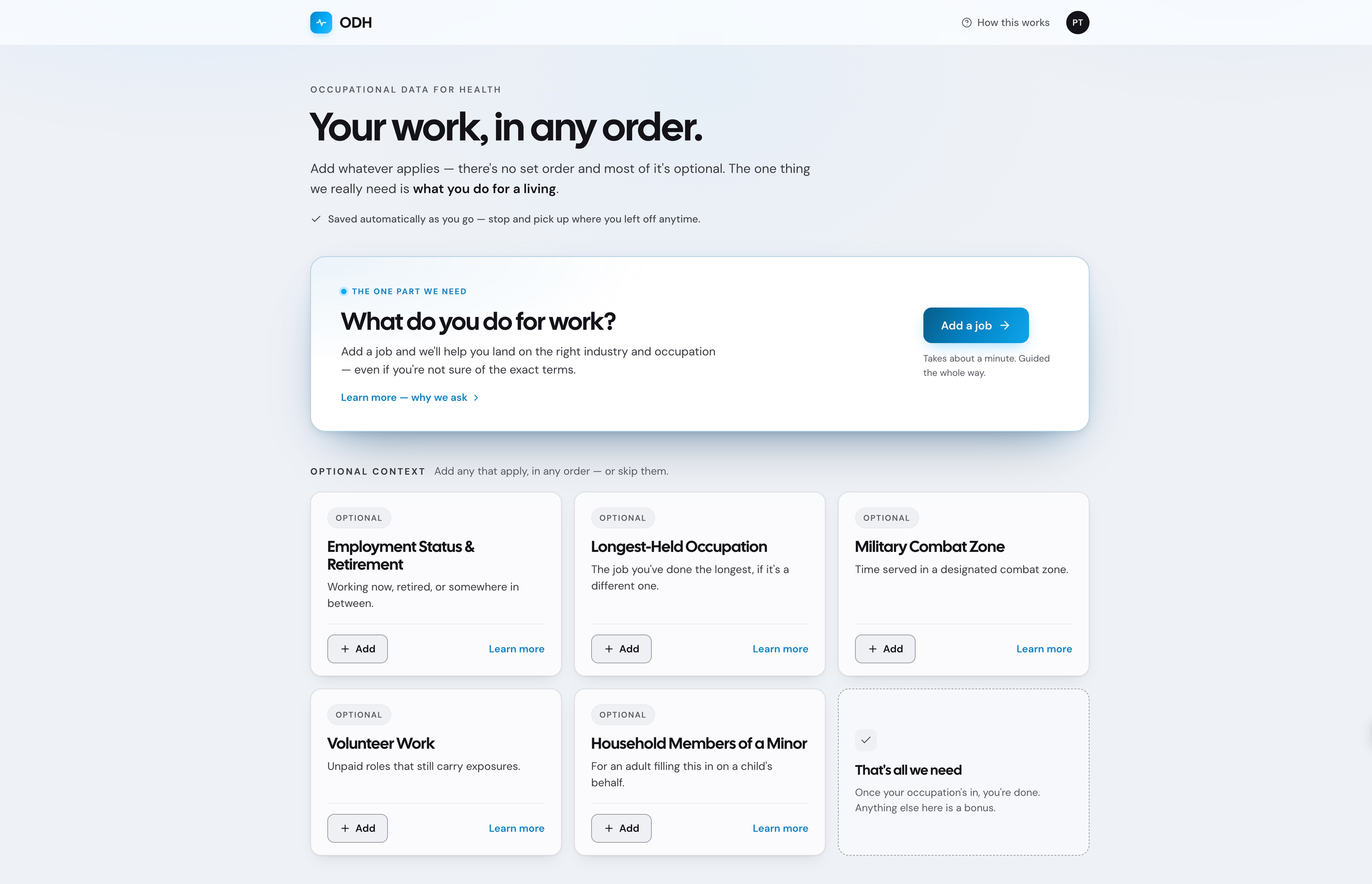
When classifying your work felt like a maze

From Guesswork to Guided Selection

Replacing friction with a clear, structured flow

ODH Project - Guided job classification interface

ODH

Occupational Data Health

The Purpose & History

The NIOSH ODH initiative aimed to build a working prototype to demonstrate how patients could enter or update work information before or during visits, while capturing occupation, industry, job history, and work-related exposures to support diagnostics, care decisions, and public health research.

The Goal

The goal wasn’t to build a full product, but to create a prototype that demonstrated the flow to vendors so they could integrate it into their systems.

Expected Adoption Flow
Ideal patient flow

Inherited Situation

Before I joined,
the project had stalled.

Years of requirements gathering and planning led to overly detailed requirements and a simplistic, unusable prototype focused on classification accuracy - not real user behavior.

The Reality Check

Issues

The result was a simplistic translation of requirements - an idealized flow that relied on perfect matches to census classifications for industry and occupation.

Example of the initial prototype
Old prototype showing rejected job entry

Main Failures

Designed for a Perfect Path.
Built On Assumptions.

Imagine sitting at a doctor’s office, not feeling your best, filling out routine forms. Then you’re asked to describe your job in standardized terms on top of everything else.

There’s no guidance, only guesswork. If it doesn’t match exactly, the system fails you.

Expected Flow
Ideal patient flow
Where It Breaks
Reality patient flow

The Insight

Users wouldn’t fail.
The system would fail them.

My Role

Rebuilding
Under Pressure

I walked into a broken system and had to rebuild it quickly under constraints. The stakeholders were running out of time to produce a viable prototype. As the only UX professional on the team, I took on a wide range of responsibilities to support the project’s needs.

The Team


Challenges & Constraints

The Context I Inherited.

The Pivot

The Redesign Strategy

The existing prototype was not usable and needed to be rebuilt quickly. To meet the goal, the new solution had to be drastically different.


A preview of key improvements

A preview of key improvements

Before: open-ended search field with rejected entry
Free-text input with no guidance
No results when input doesn't match exactly
After: guided dropdown with closest matches
Structured prompts guide input
Closest matches surface automatically
Before: confusing input
No hints or structure
Users don't know what to type
After: guided prompts
Step-by-step guidance
Clear expectations

Understanding the Users

What Shaped the Design

Two very different user groups shaped the redesign. With no prior research available, the personas were synthesized from stakeholder and SME conversations, then sharpened through usability testing.

Patients

People at a doctor’s office trying to complete required forms quickly before their visit.

Needs

  • Get through paperwork quickly
  • See the doctor without delays
  • Provide only necessary info

Challenges

  • Too much paperwork
  • Repeating the same information each visit
  • Sharing too much personal information

Vendors

Provide systems used in medical offices to capture and manage patient information.

Needs

  • Capture up-to-date information
  • Add data without disruptions
  • Ensure adoption and usability

Challenges

  • Integrating new flows into existing systems.
  • More steps for providers during visits
  • Uncertain return on investment

Guiding Principles

In response to constraints, stakeholder input, and user needs, the following principles guided the redesign.

The Changes

Design Ideation

The redesign process began in low fidelity, focusing on how users move through the workflow before visual design was introduced. The goal was to simplify how users search, narrow options, and keep track of progress while working through complex job selection tasks.

Guided Search & Controlled Refinement

Instead of forcing users into dead ends or overwhelming result lists, the system introduces guided refinement and controlled exploration from the very first interaction.

Guided Search & Controlled Refinement — Before Guided Search & Controlled Refinement — After

Progressive Guided Selection

The workflow shifts from deep trees and long dropdowns to progressive narrowing, revealing relevant occupations only after users establish broader intent.

Progressive Guided Selection — Step 1, Before Progressive Guided Selection — Step 1, After Progressive Guided Selection — Step 2, Before Progressive Guided Selection — Step 2, After Progressive Guided Selection — Step 3, Before Progressive Guided Selection — Step 3, After

Persistent Exploration State

The system preserves previously explored categories and selections, allowing users to compare options without repeating work or relying on memory.

Persistent Exploration State — Before Persistent Exploration State — After

Usability Testing

User Feedback

The sessions revealed consistent patterns in how users approached decisions and interacted with the system, highlighting where additional guidance and feedback were needed.

Key Insights

Testing highlighted several expectations users had throughout the flow:

Final Design

High Fidelity

The redesigned prototype turned a confusing, failure-prone process into a guided experience that helped patients identify their work information step by step without needing to know exact industry or occupation classifications.

Progressive Guided Selection

The redesigned flow guided users from broader industry and occupation categories into more specific selections, reducing guesswork and helping users narrow choices progressively without needing the “correct” answer upfront.

Search results state with conversational field label, result count banner, and guidance CTA
1Active tab

Persistent section indicator keeps users oriented. Placeholder rationale.

2Field label

"My job is a(n)" replaces clinical "Occupation" for a conversational tone. Placeholder rationale.

3Result count

Shows the number of matches before committing. Placeholder rationale.

4Guidance CTA

Action framed as collaborative help, not navigation. Placeholder rationale.

General Occupation list with carousel cards and pagination
1Numbered step

"1. General Occupation" structures the decision into two steps. Placeholder rationale.

2History link

Always-available browsing history affordance. Placeholder rationale.

3Pagination

Breaks 15 categories into manageable chunks. Placeholder rationale.

4Selected card

A single emphasized card previews selection. Placeholder rationale.

Specific Occupation section revealed after picking a general category
1Done CTA

"I am done" activates only after a valid selection. Placeholder rationale.

2Inline description

Description appears right where the choice happens. Placeholder rationale.

3Specific step

Step 2 continues inline — no page jump. Placeholder rationale.

4Specific match

Picking the specific match finalizes the choice. Placeholder rationale.

Browsing history panel showing accumulated category browses
1History panel

History accumulates automatically as users browse. Placeholder rationale.

2Browse count

"8 browsed" surfaces progress through the search space. Placeholder rationale.

3Jump back

One click jumps back to any prior browse. Placeholder rationale.

4State preserved

Selection stays highlighted across sections. Placeholder rationale.


Patient Work Summary

The Patient Work Summary brings occupations, industries, exposures, and work history into one place, helping users clearly see progress, review information, and identify what was still missing.

Patient Work Summary in its empty starting state, showing all sections ready to fill
Work History section expanded with multiple jobs visible
1Main Summary anchor

"Main Summary" anchors users across the multi-section flow. Placeholder rationale.

2Plain-language sections

Sections named in everyday terms, not clinical jargon. Placeholder rationale.

3Single clear action

One obvious "+ Add new" per empty section. Placeholder rationale.

4Same section, populated

Section identity preserved across states. Placeholder rationale.

5Repeating cards

Each job uses the same card structure, no new layout to learn. Placeholder rationale.

6Show more

Collapsed by default, expandable on demand. Placeholder rationale.


Household Exposure Tracking

The redesigned flow allowed patients to add household members and related work exposure information, helping capture possible occupational exposures brought into the home.

Add A Member — form for entering a new household member's details
1Marker 1

Placeholder rationale for marker 1.

2Marker 2

Placeholder rationale for marker 2.

3Marker 3

Placeholder rationale for marker 3.

4Marker 4

Placeholder rationale for marker 4.

Provide Work Information — member added, work history fields revealed
1Marker 1

Placeholder rationale for marker 1.

2Marker 2

Placeholder rationale for marker 2.

3Marker 3

Placeholder rationale for marker 3.

4Marker 4

Placeholder rationale for marker 4.

Household Overview — full list of household members with summarized work info
1Marker 1

Placeholder rationale for marker 1.

2Marker 2

Placeholder rationale for marker 2.

3Marker 3

Placeholder rationale for marker 3.

4Marker 4

Placeholder rationale for marker 4.

Looking Back

Outcome & Limitations

Adoption Outcome

The prototype improved usability and showed a clear path forward, but it was not adopted by vendors.

Outcome

What This Enabled

  • Users can complete tasks without guessing
  • Complex decisions are broken into manageable steps
  • The system supports uncertainty instead of punishing it
  • Users maintain context and momentum throughout

Limitation

Why It Didn't Move Forward

  • Vendors were not involved early
  • No foundational user or stakeholder research
  • Mismatch with real-world vendor constraints