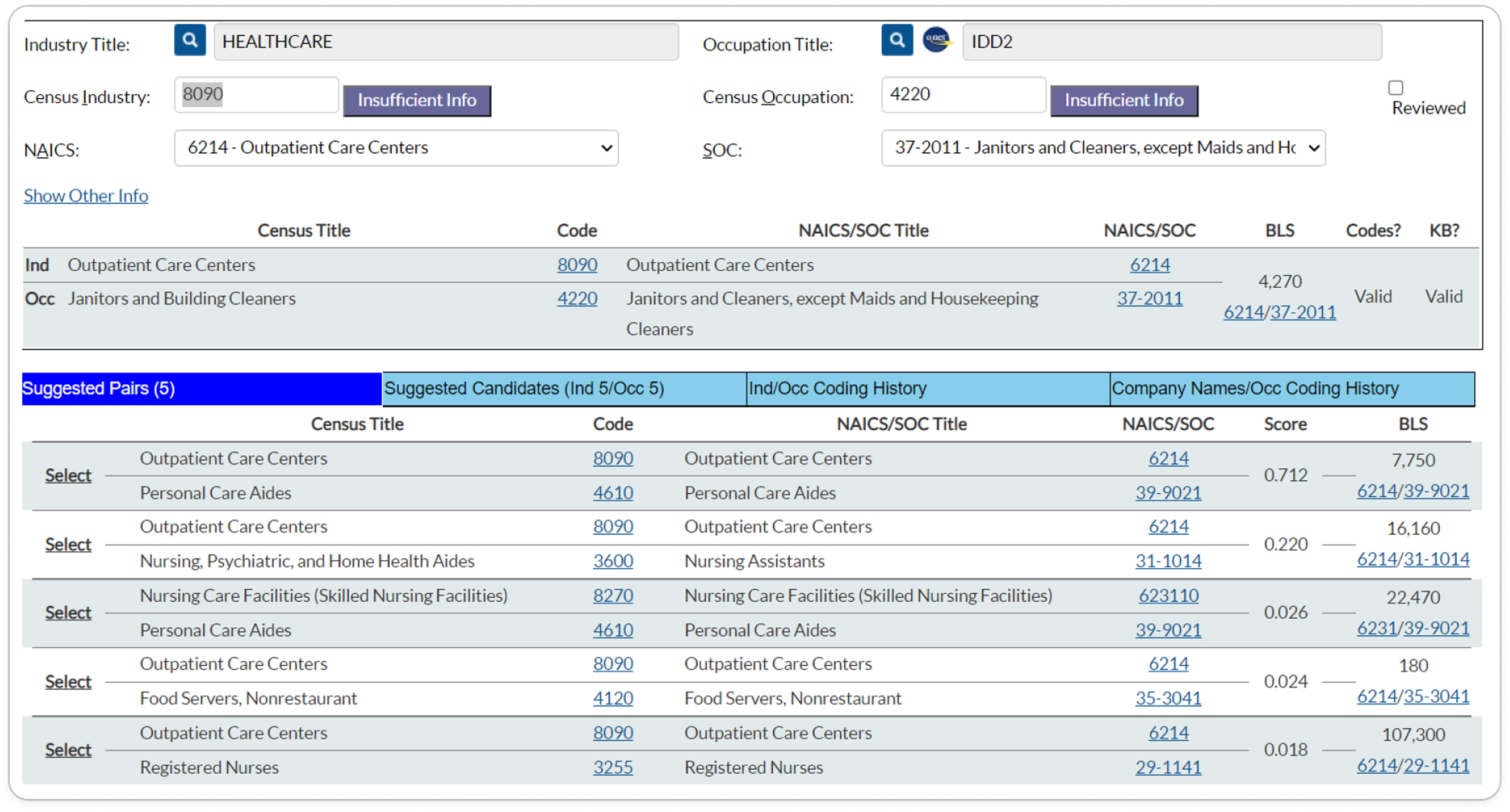
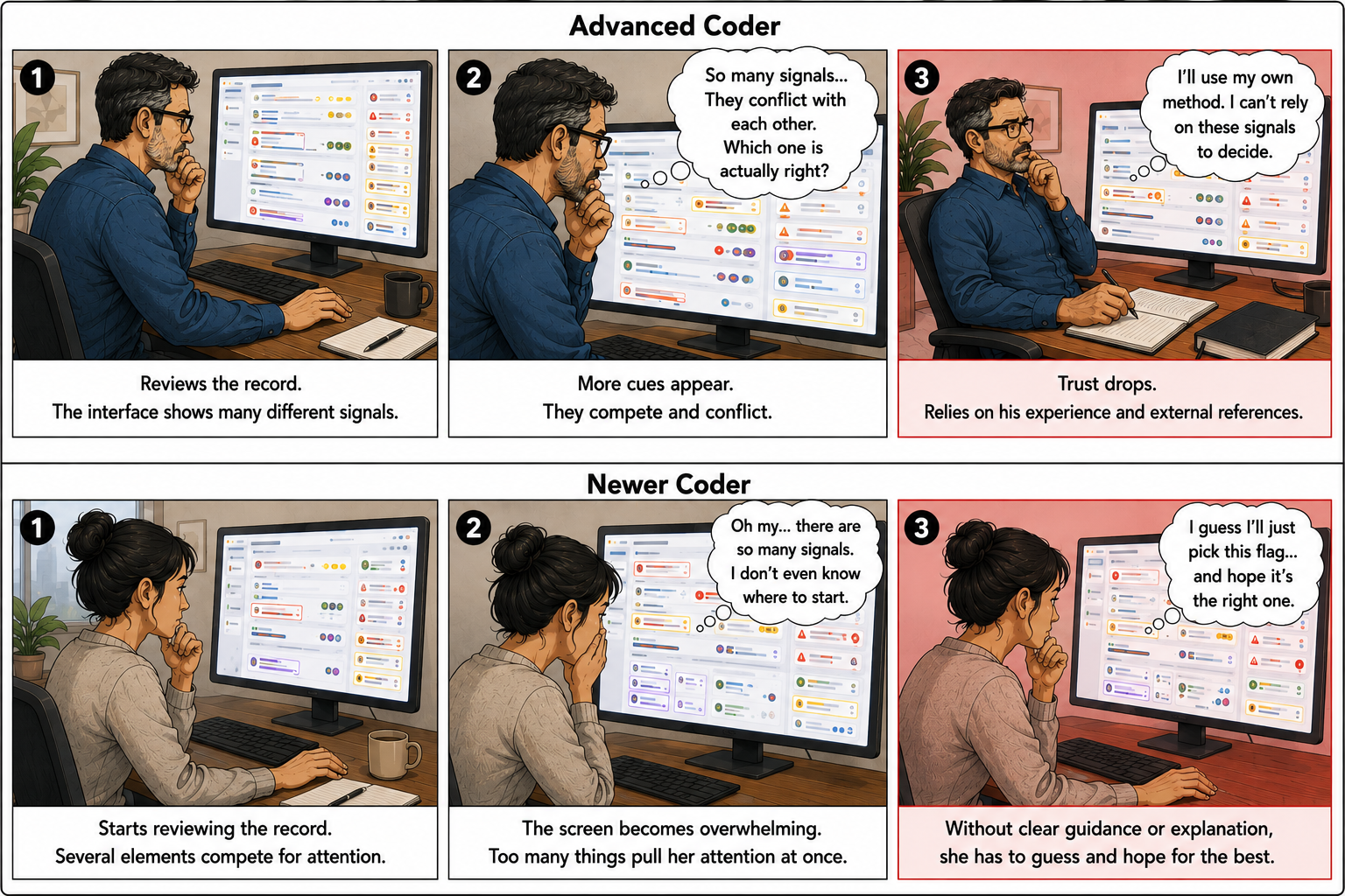
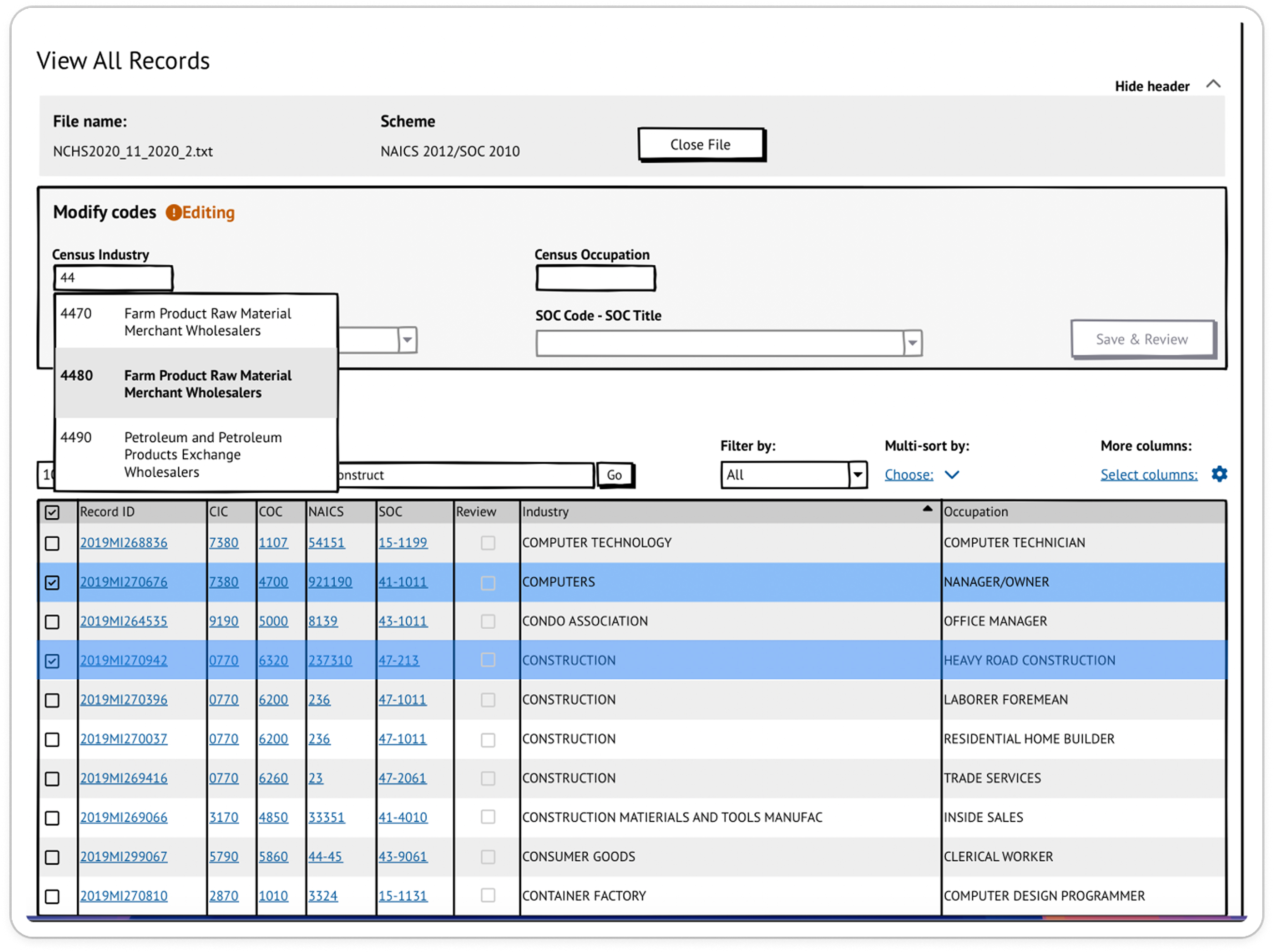
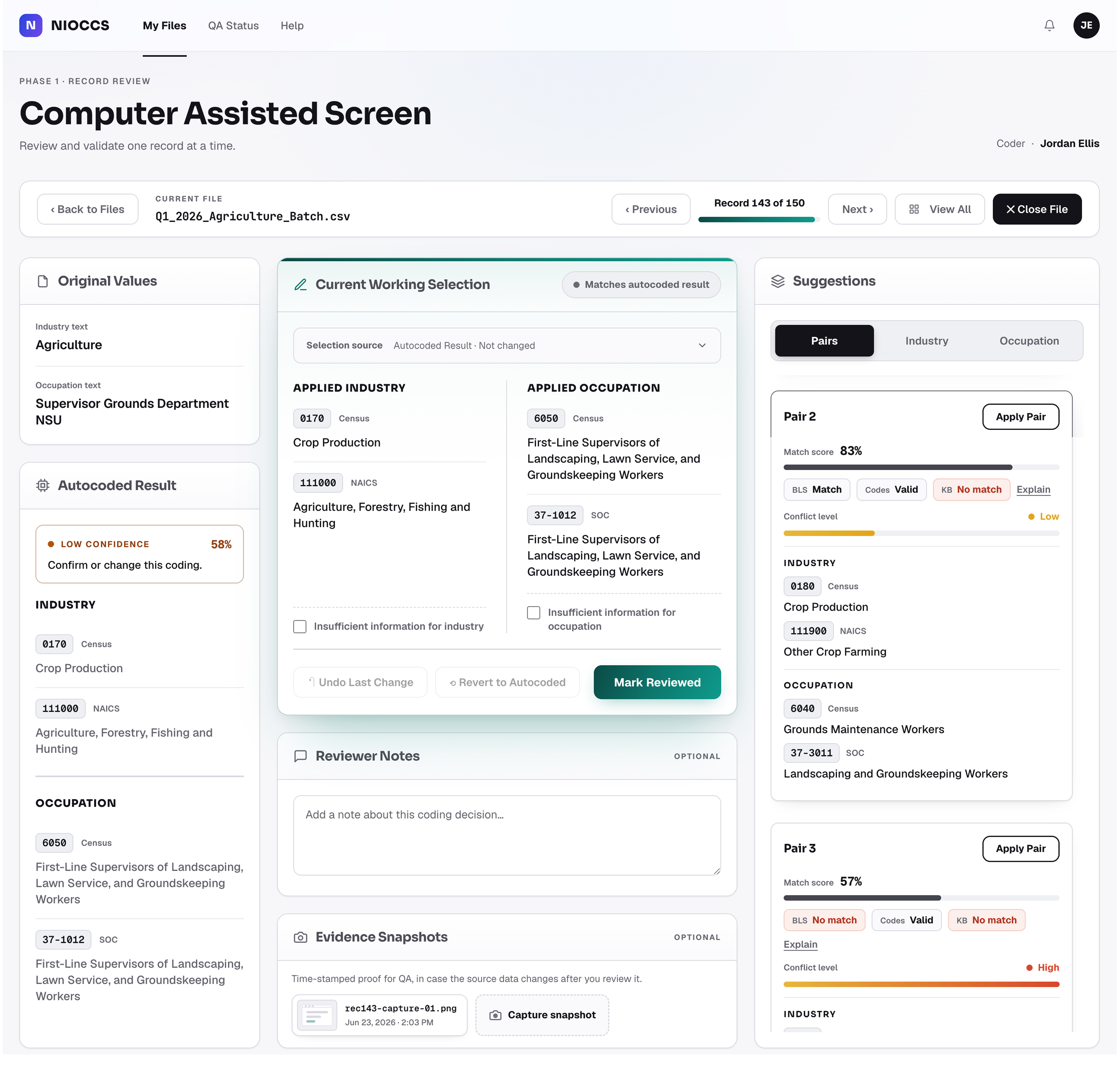
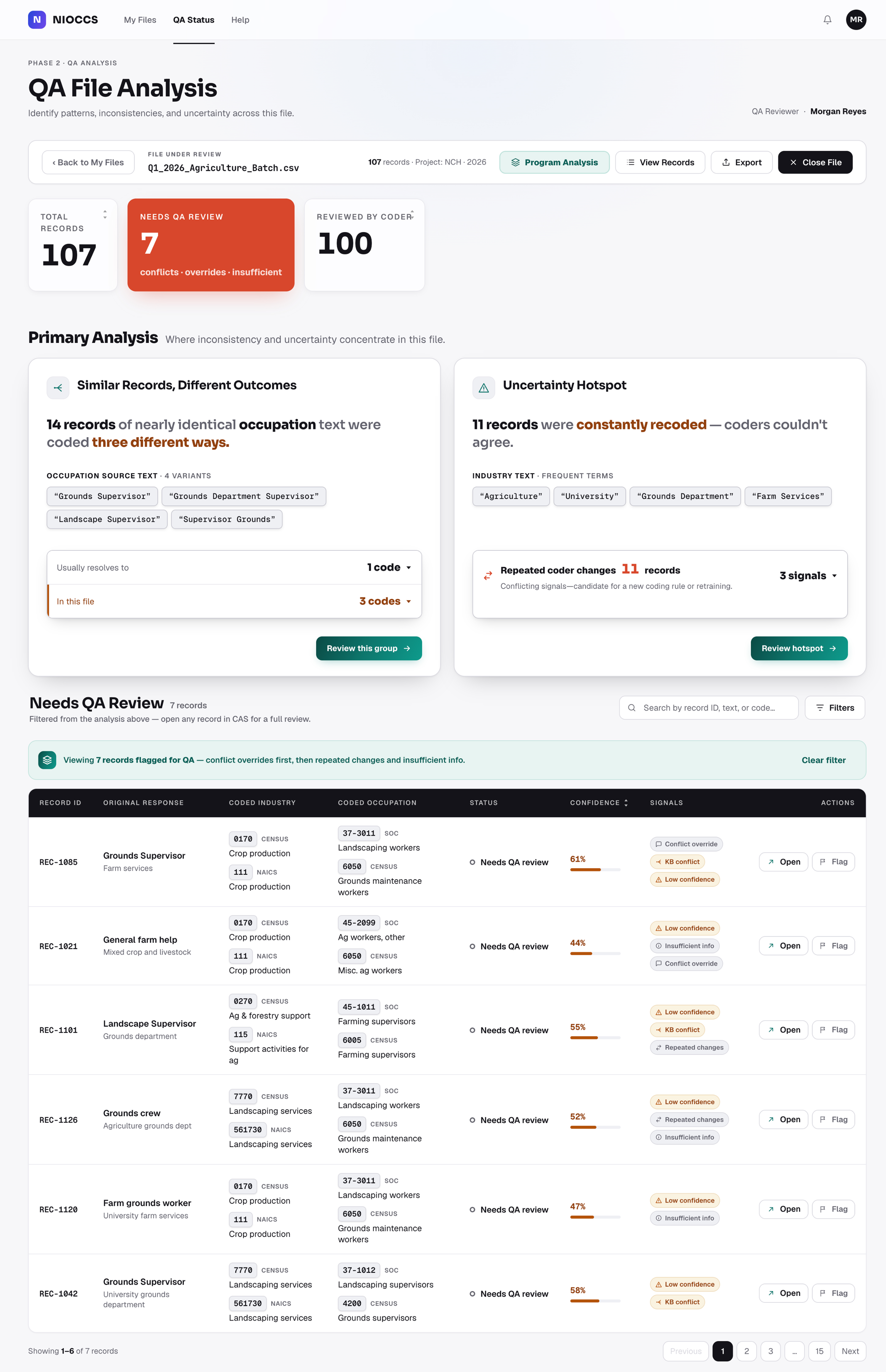
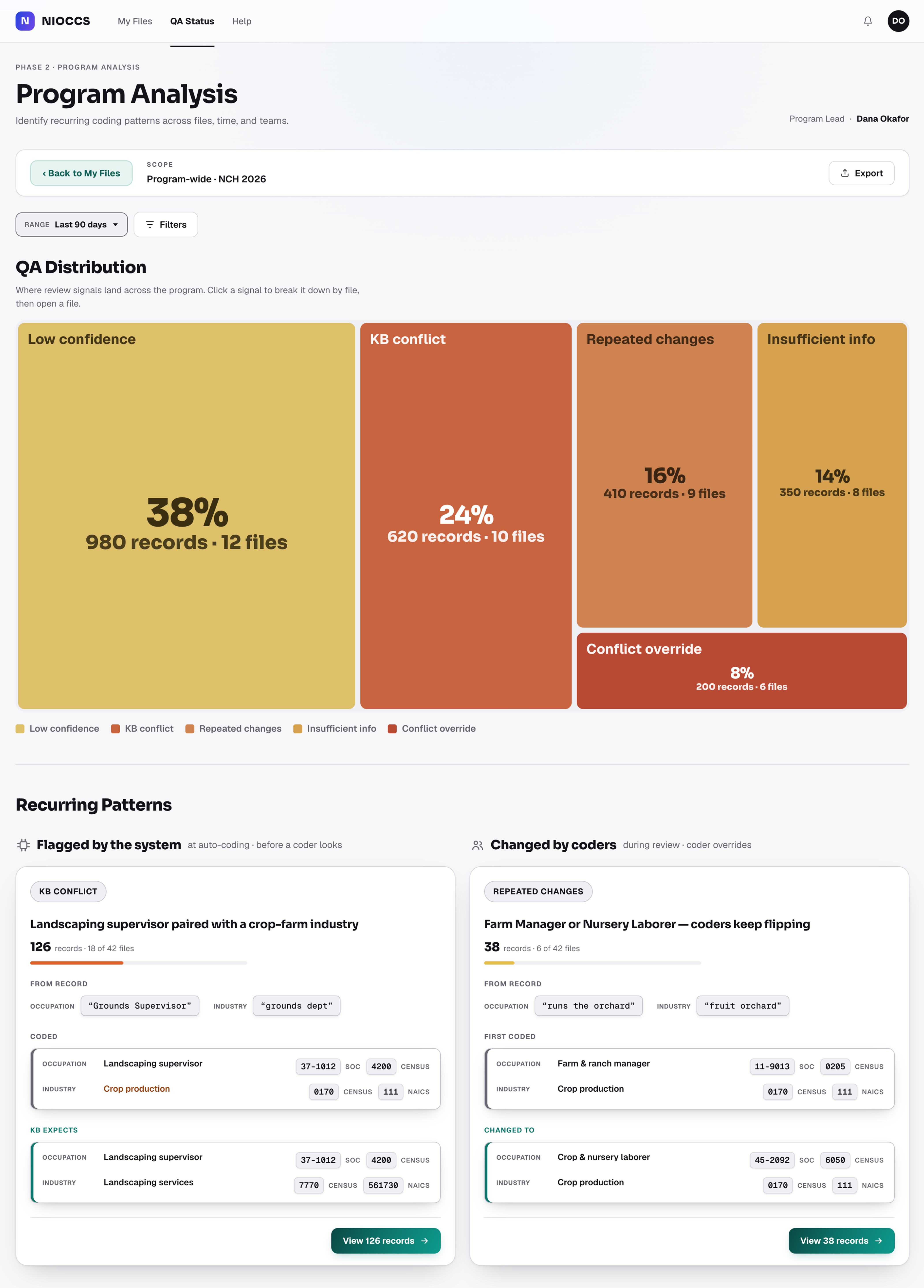
A crowded header - too many controls at once.
Every signal looks the same - no way to tell which to pay attention
to.
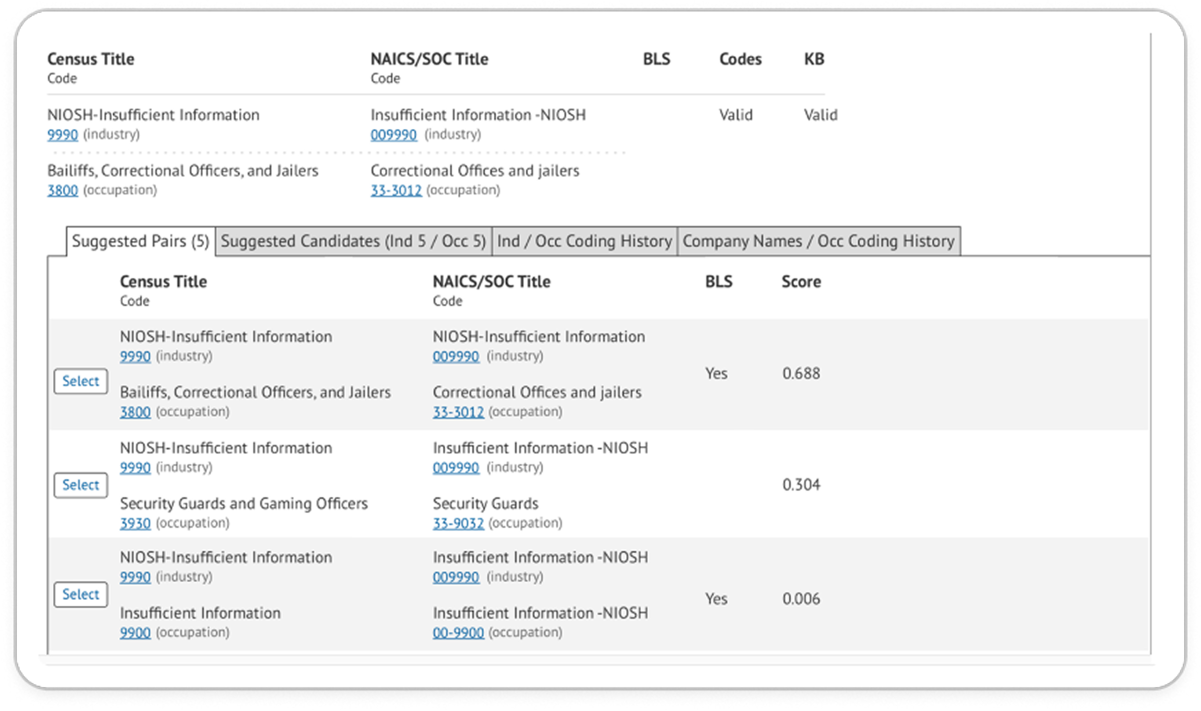
Densely packed signals - hard to tell what to do or choose.
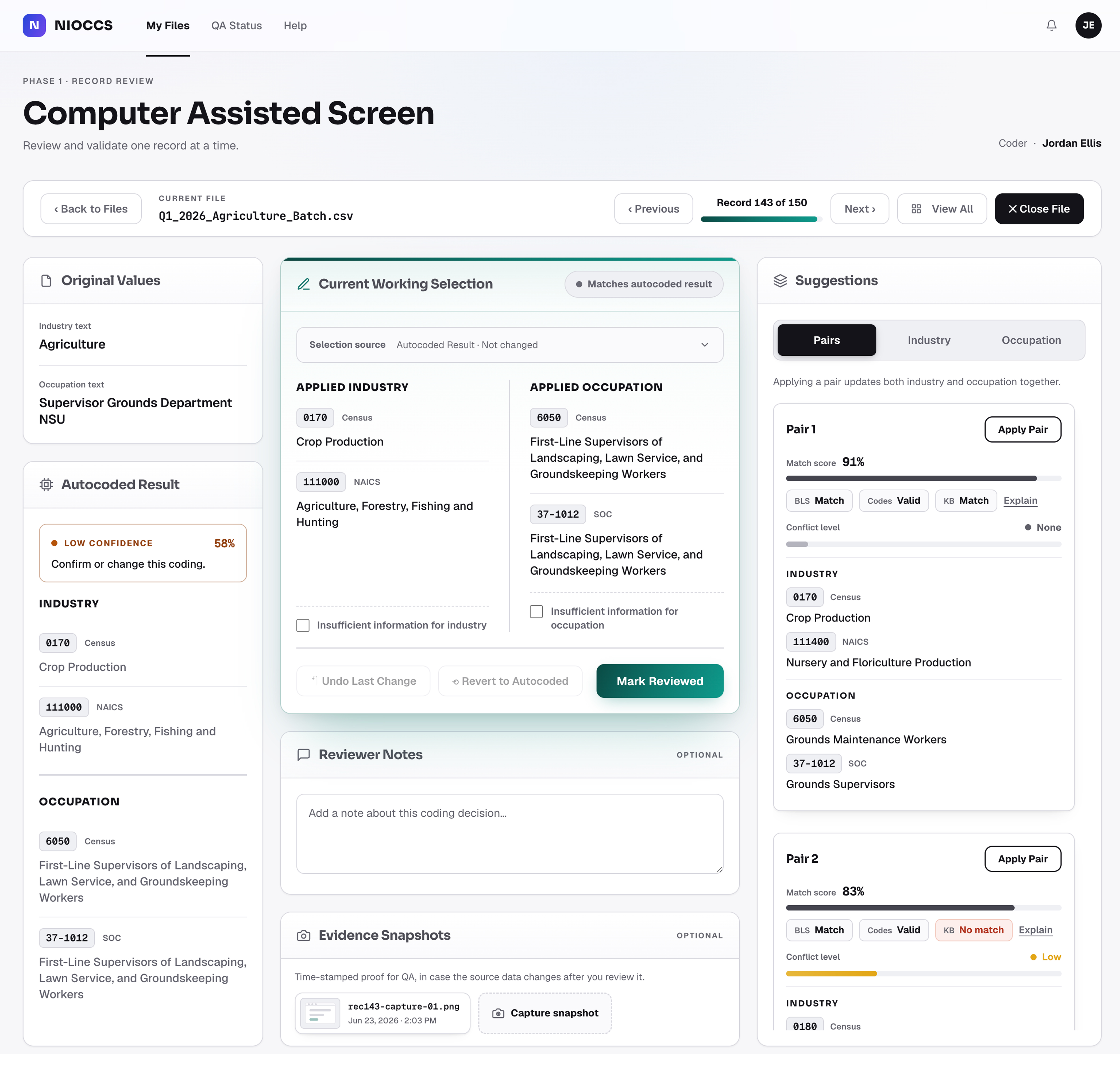
The actual suggested pairs are buried in a dense table.
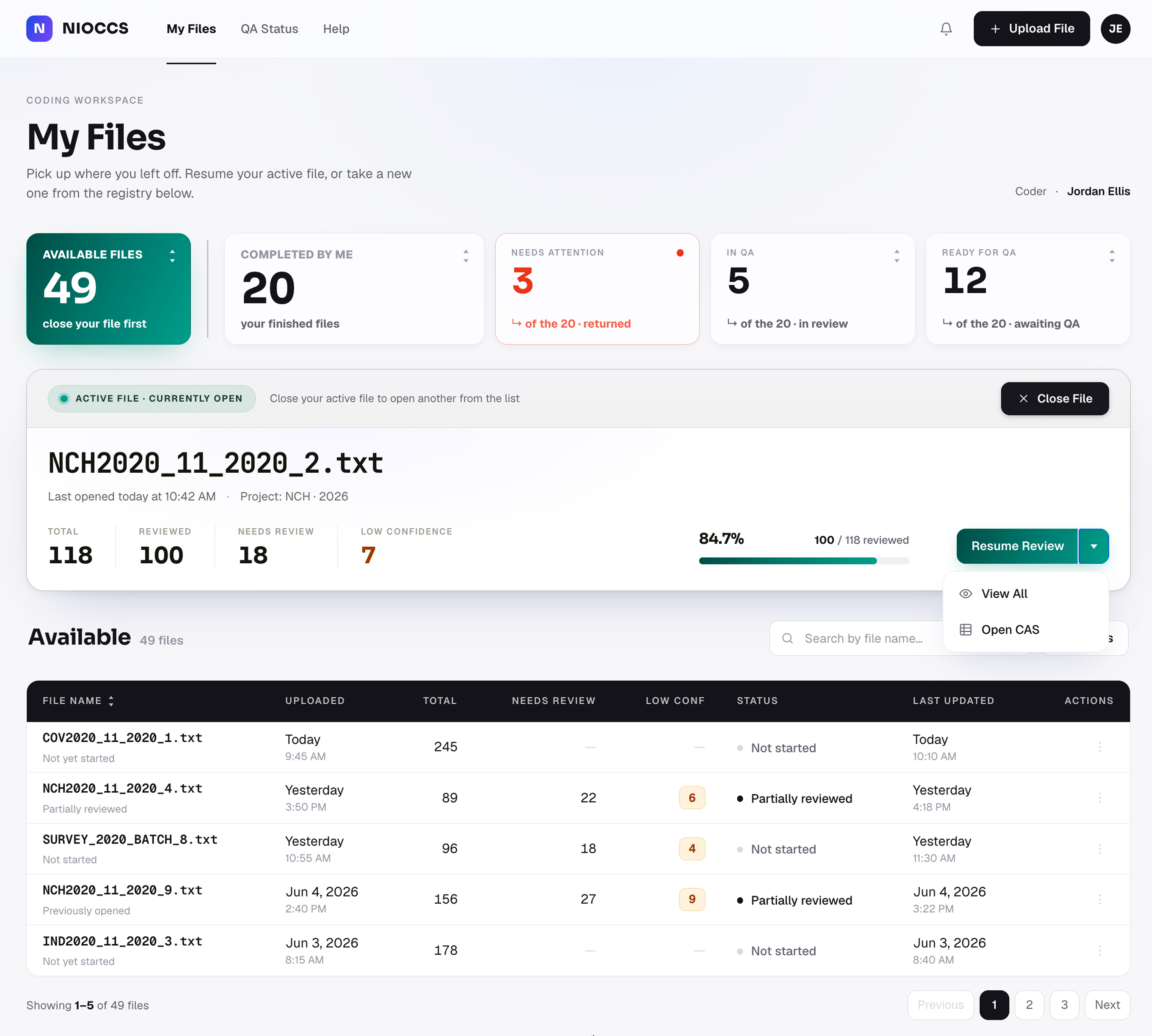
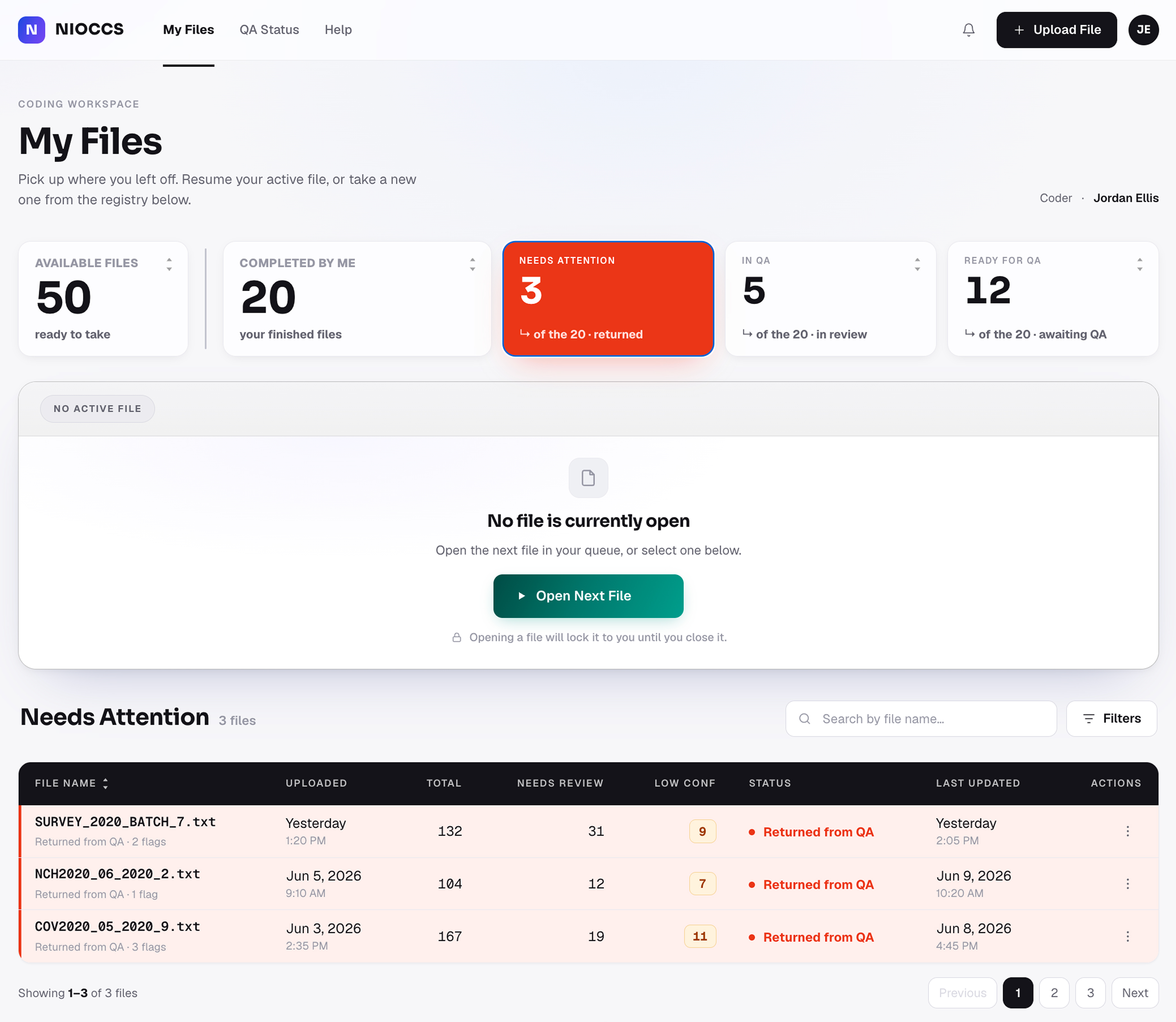
Current applied codes, summarized cleanly up top.
Select a suggested pair in one click.
Each pair shows a confidence score.
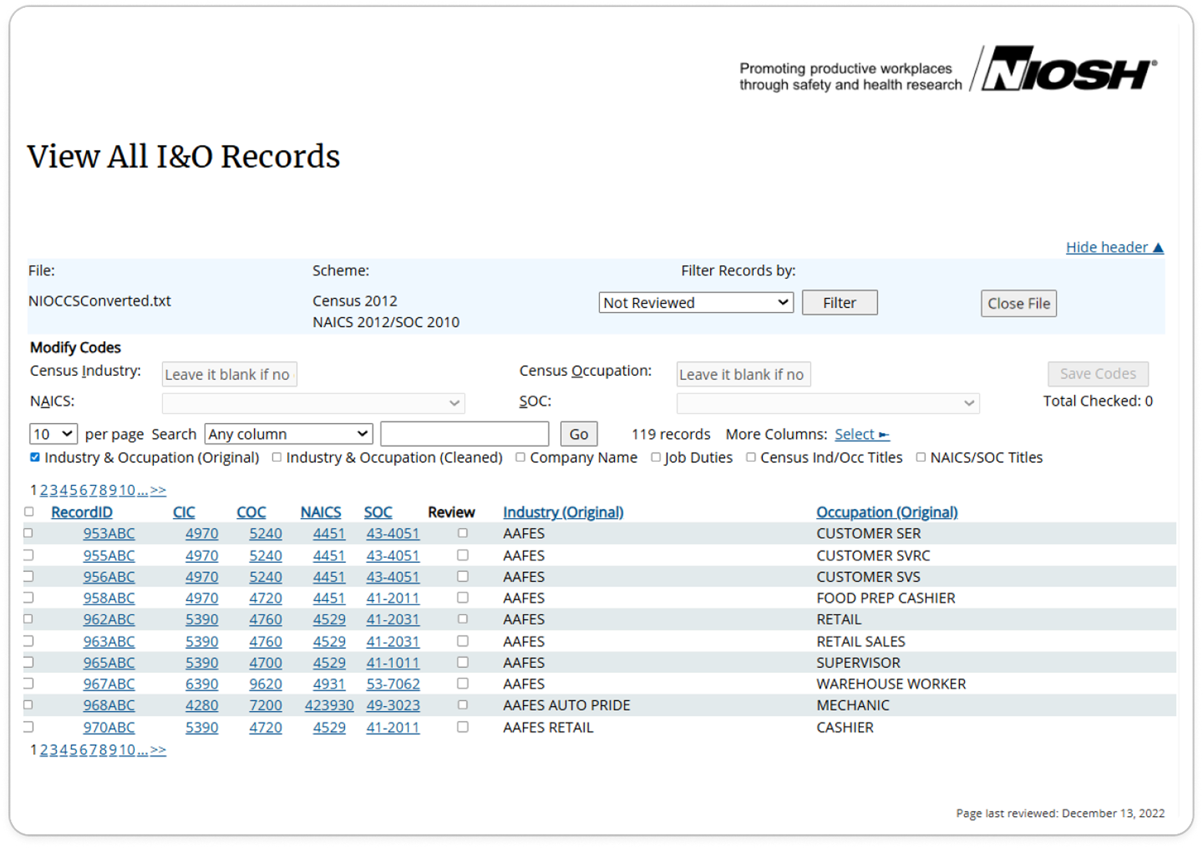
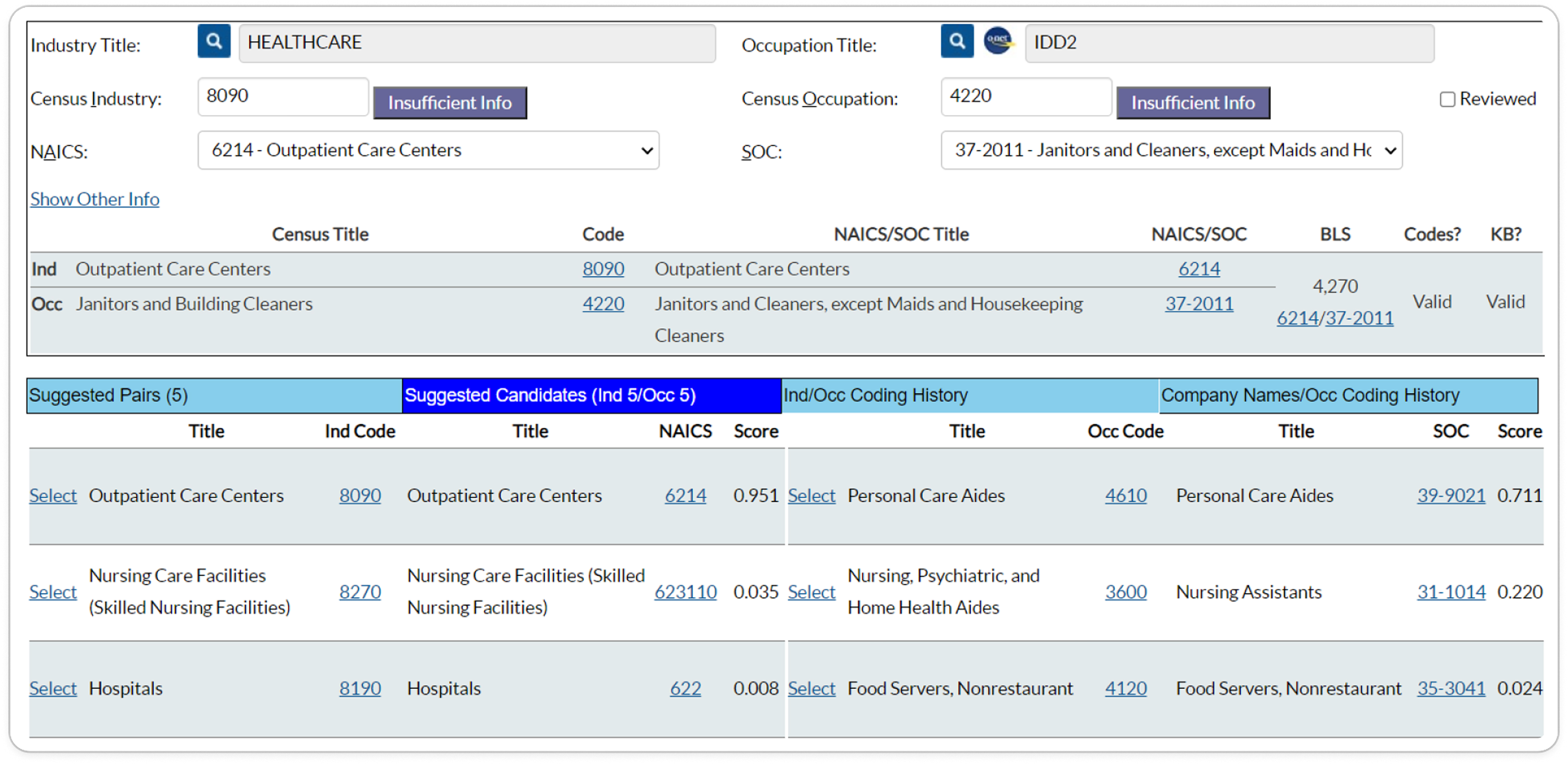
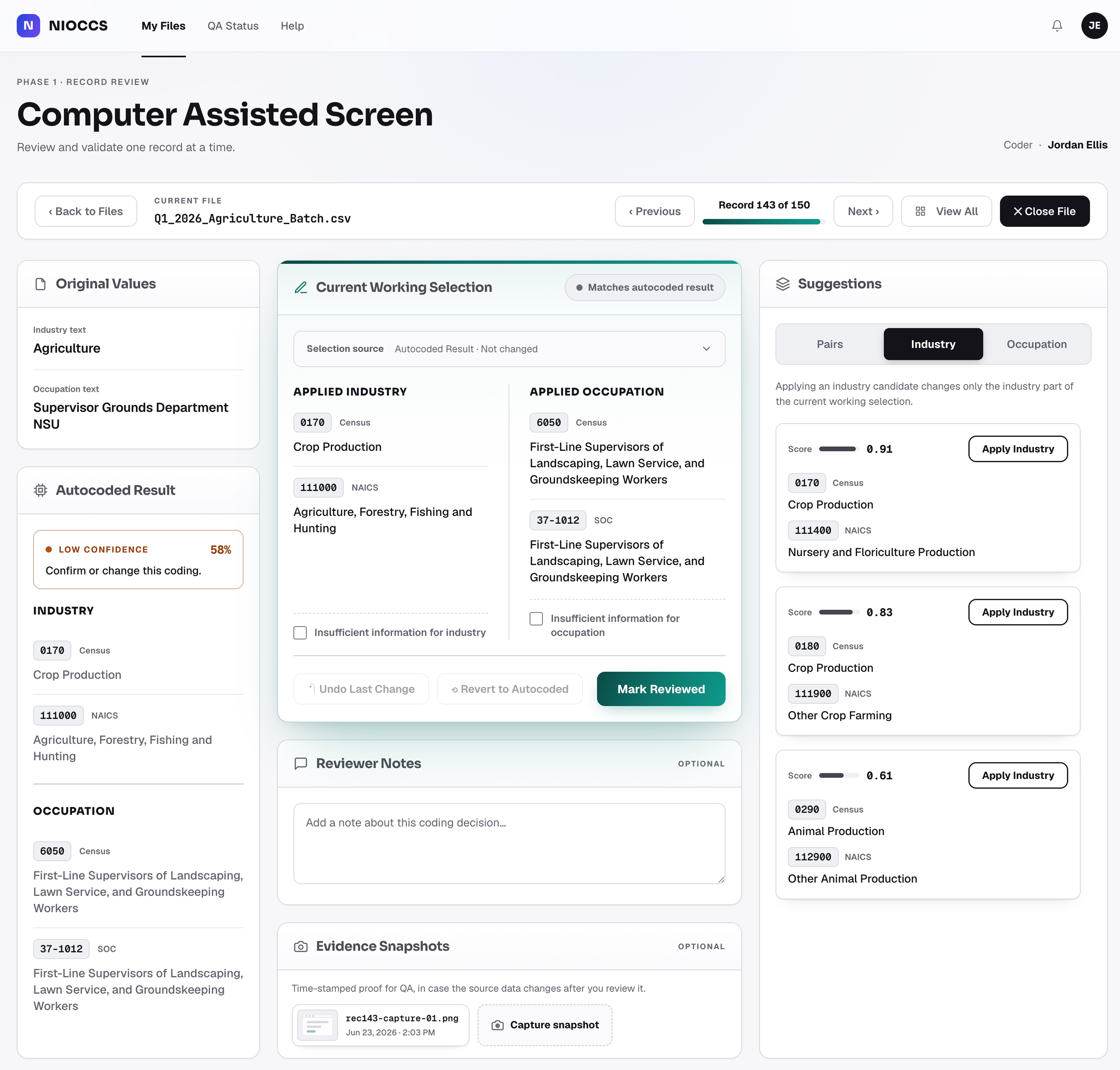
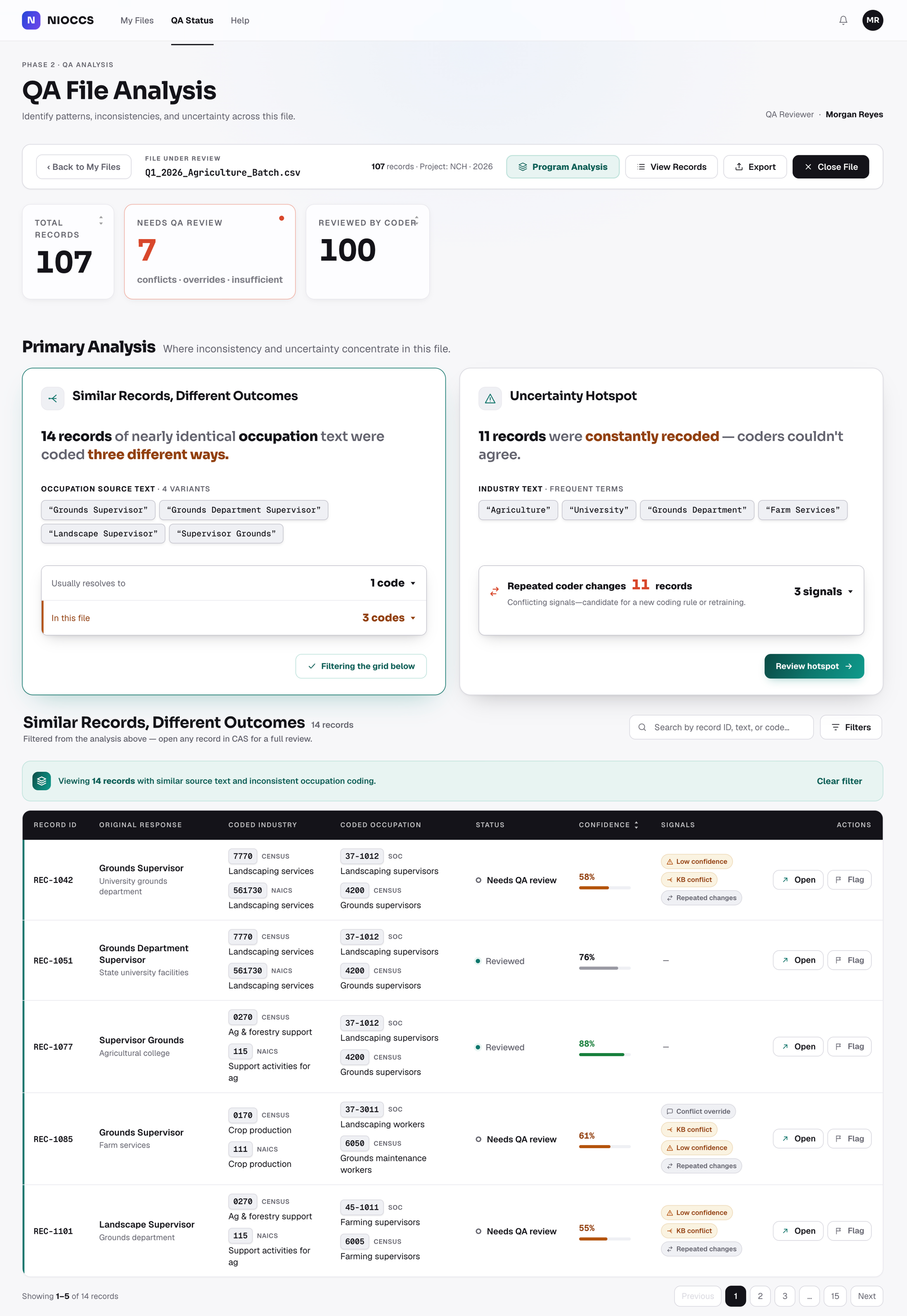
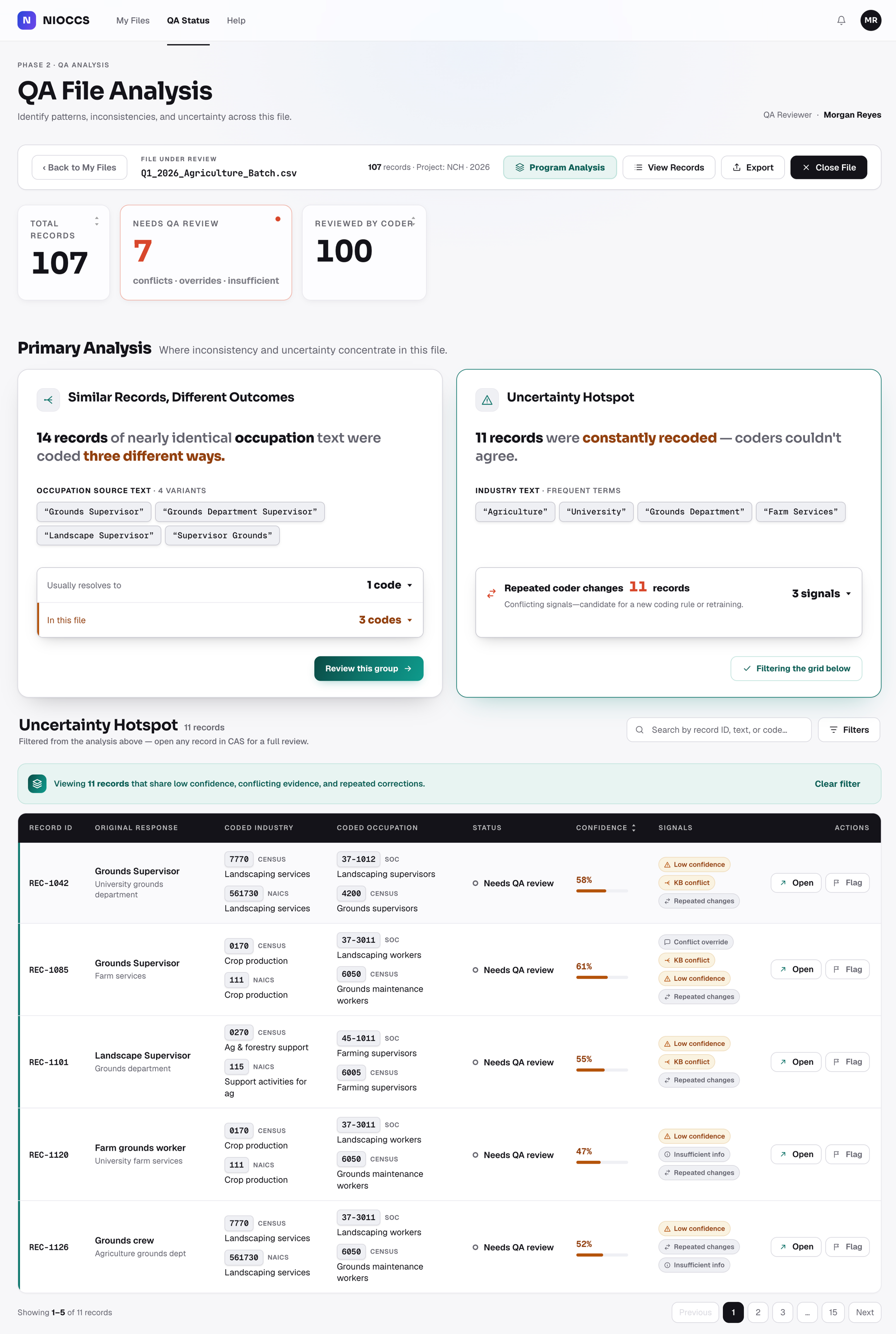
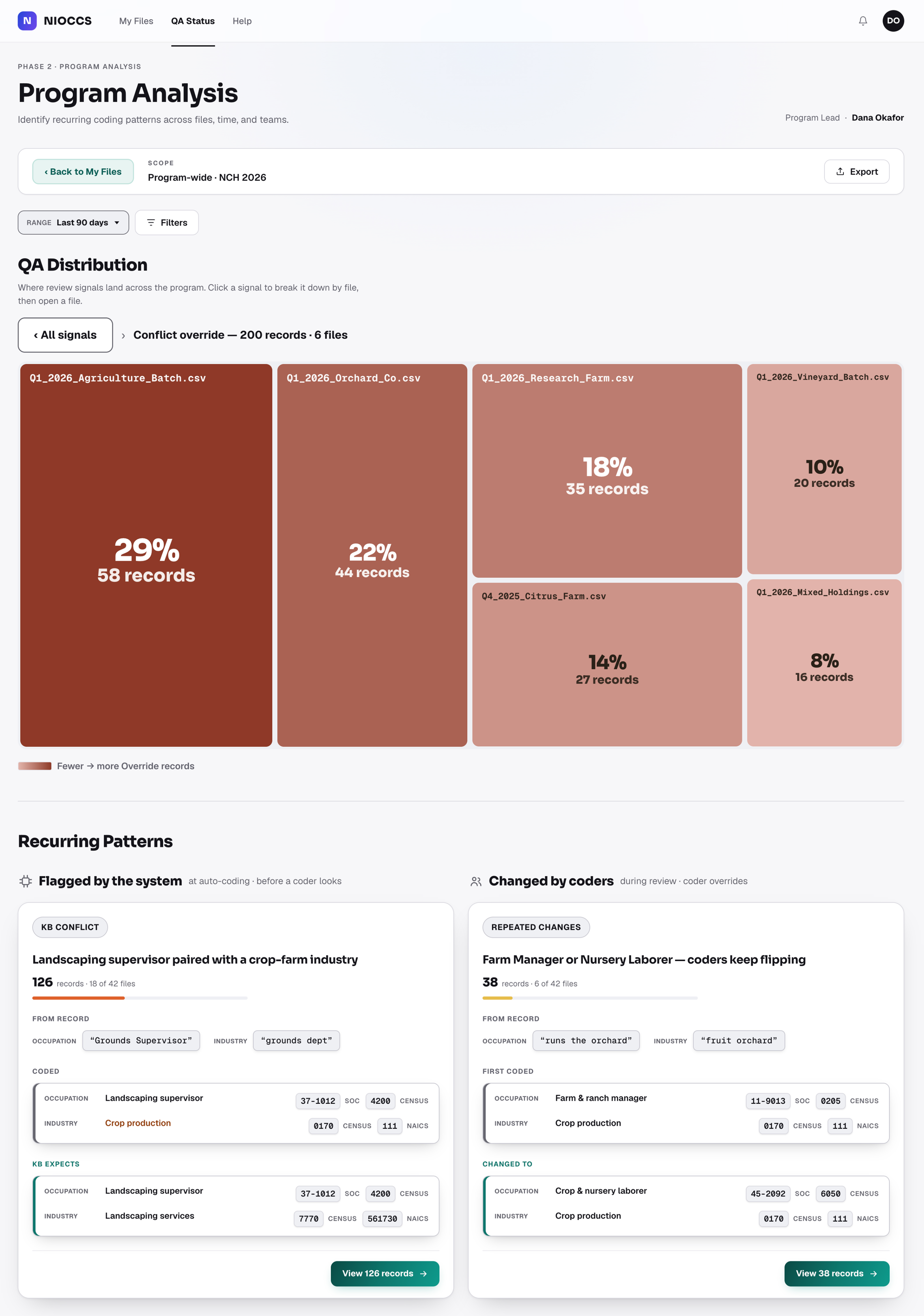
The same crowded header carries over.
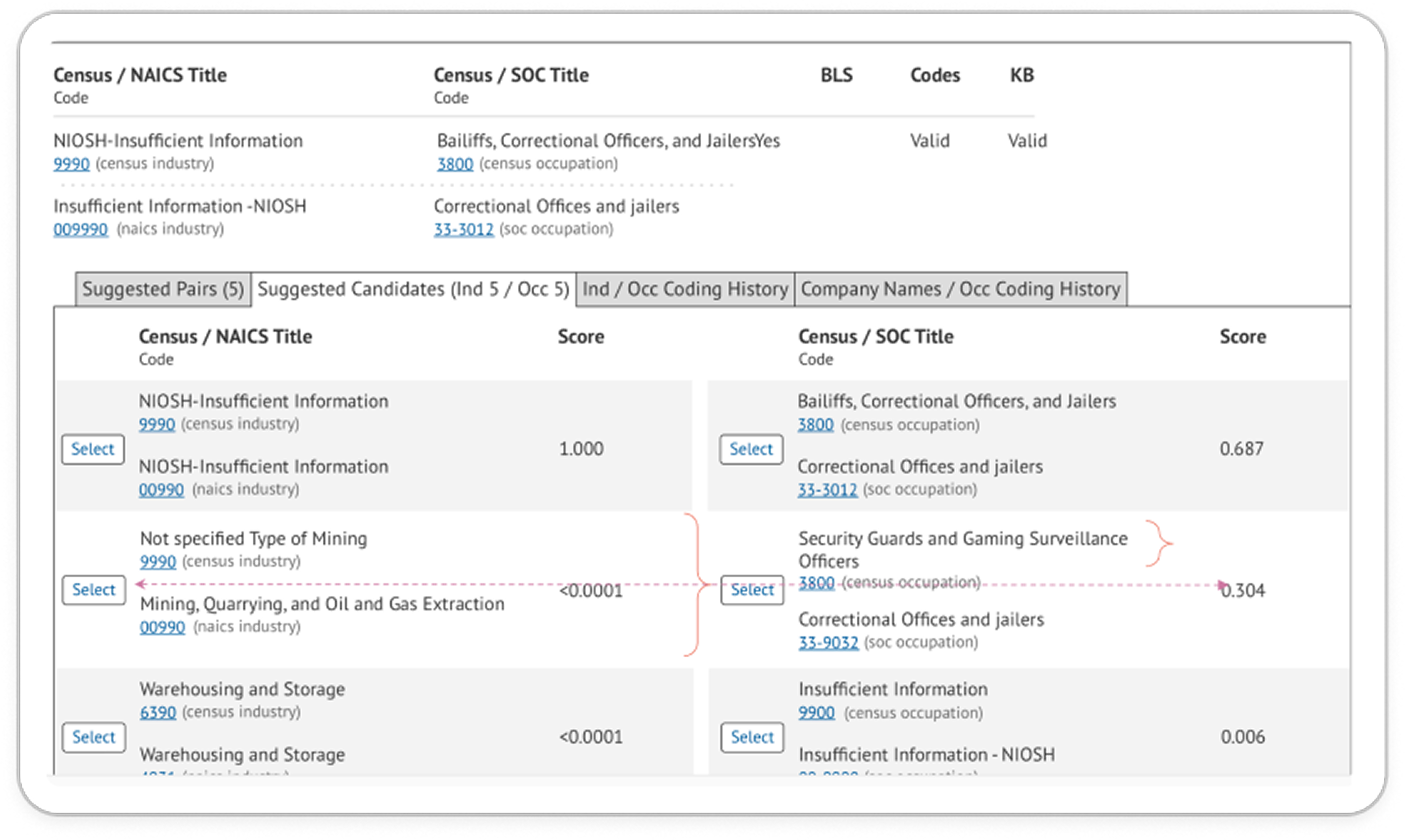
Industry and occupation candidates split across dense columns.
Applied codes summarized cleanly up top.
Select an industry or occupation code on its own.
Each candidate carries its own confidence score.
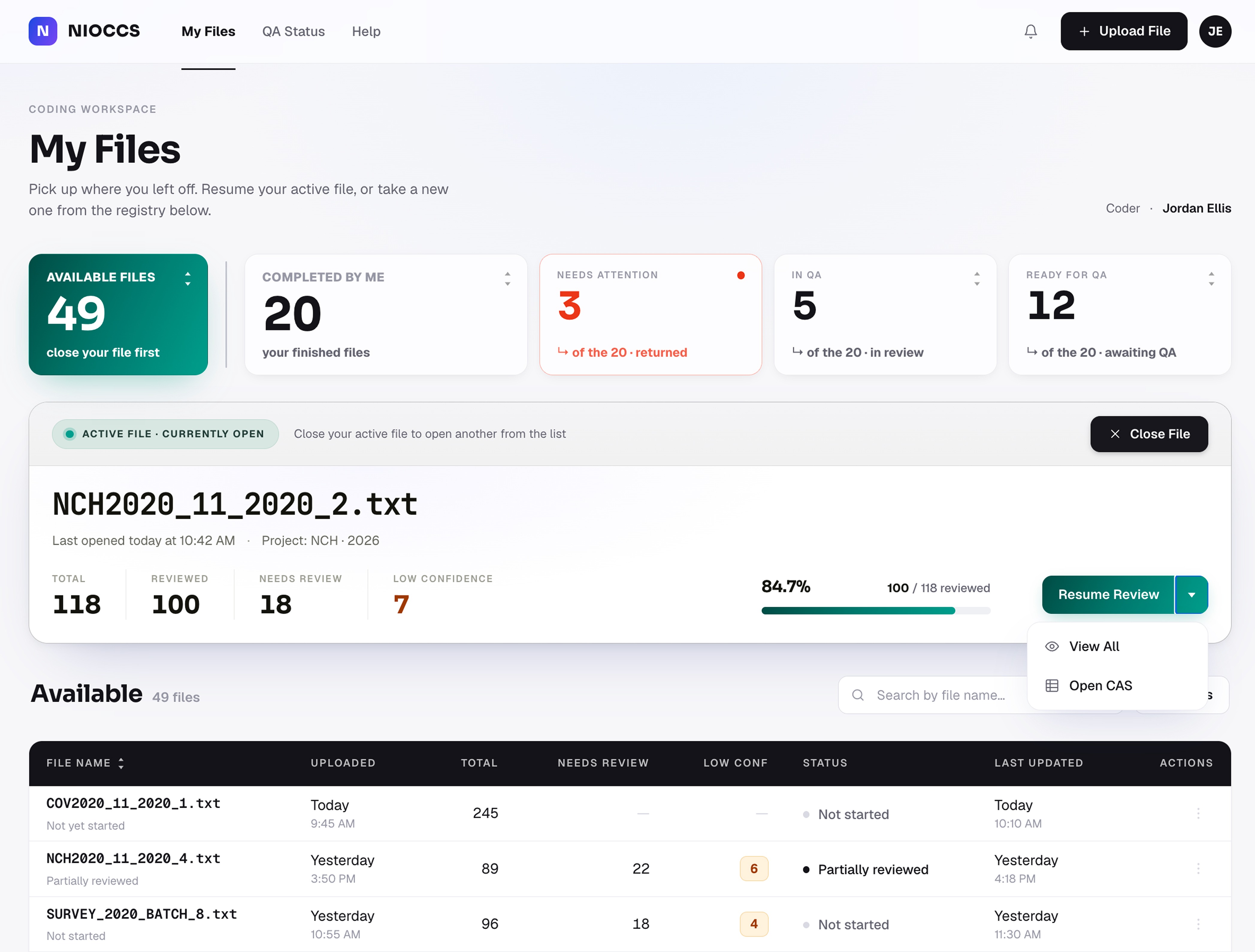
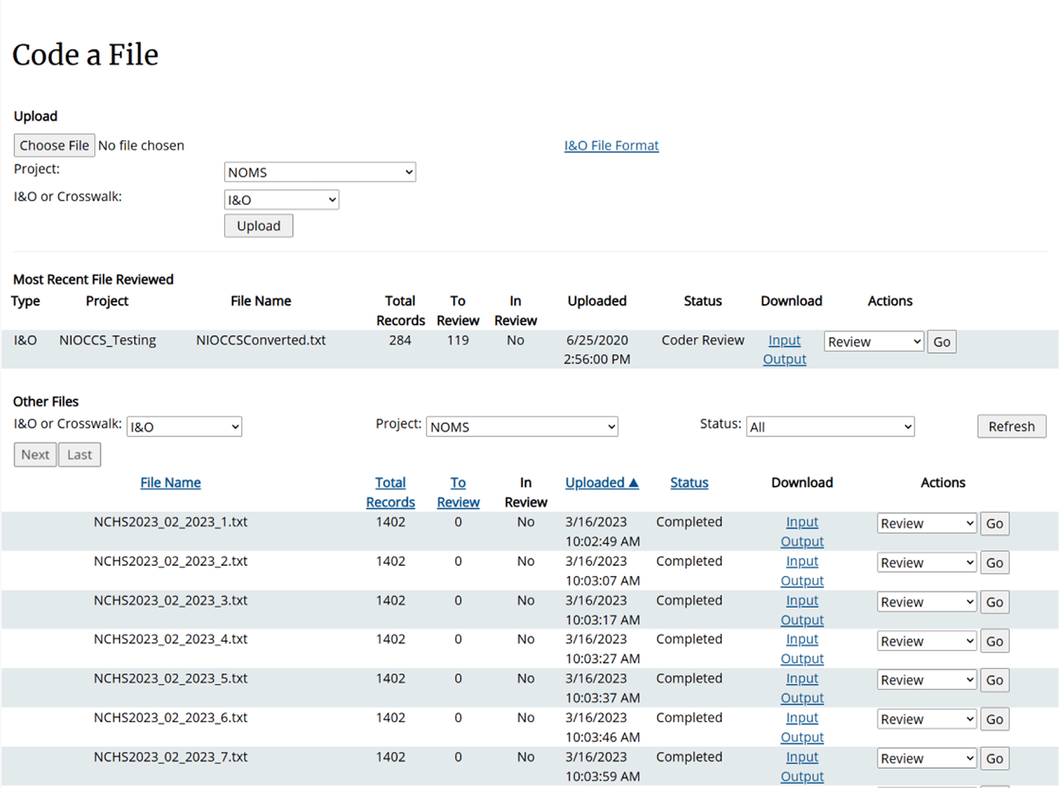
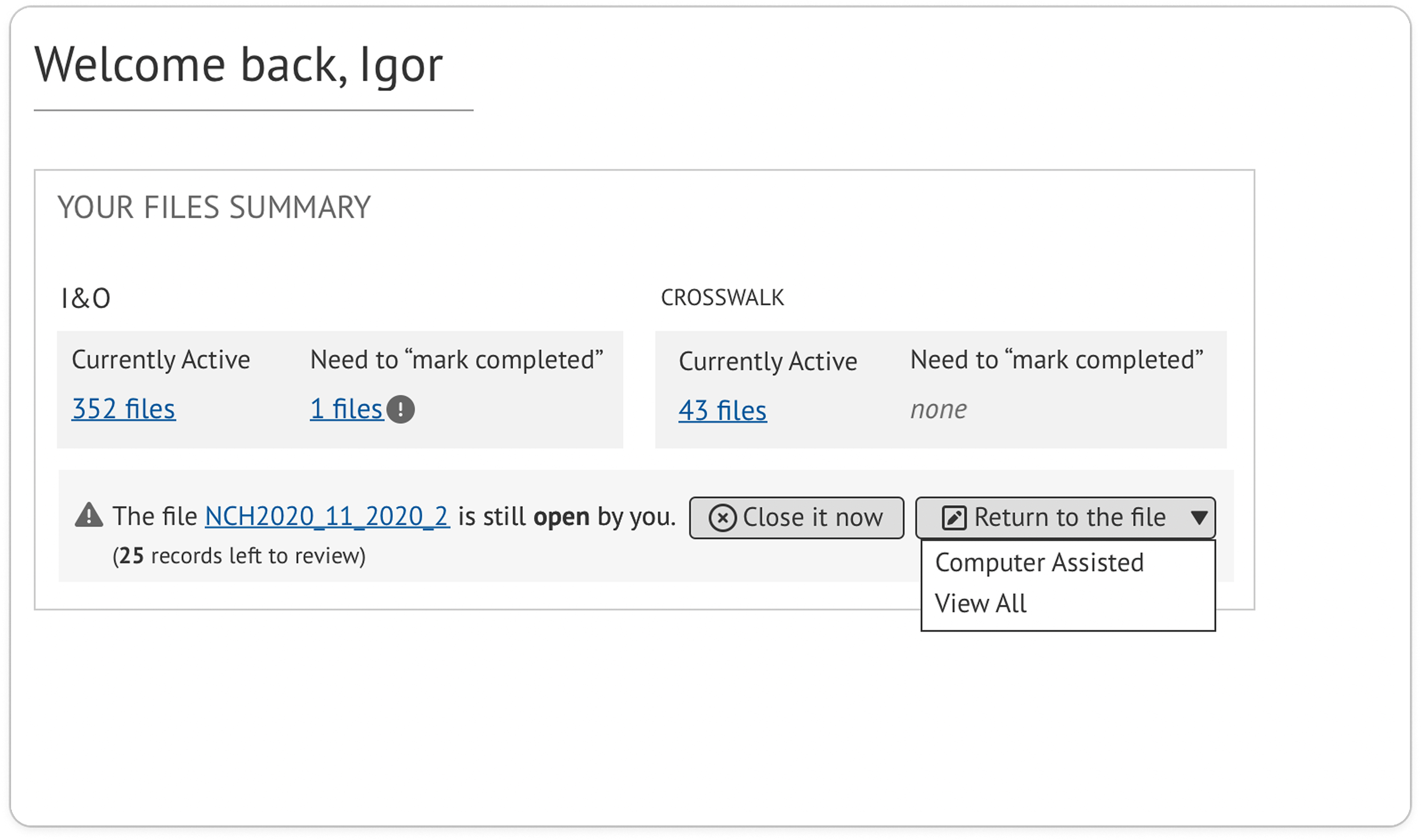
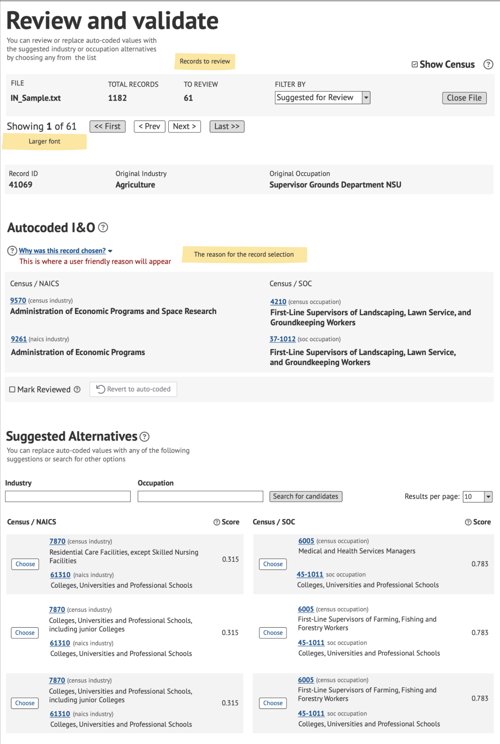
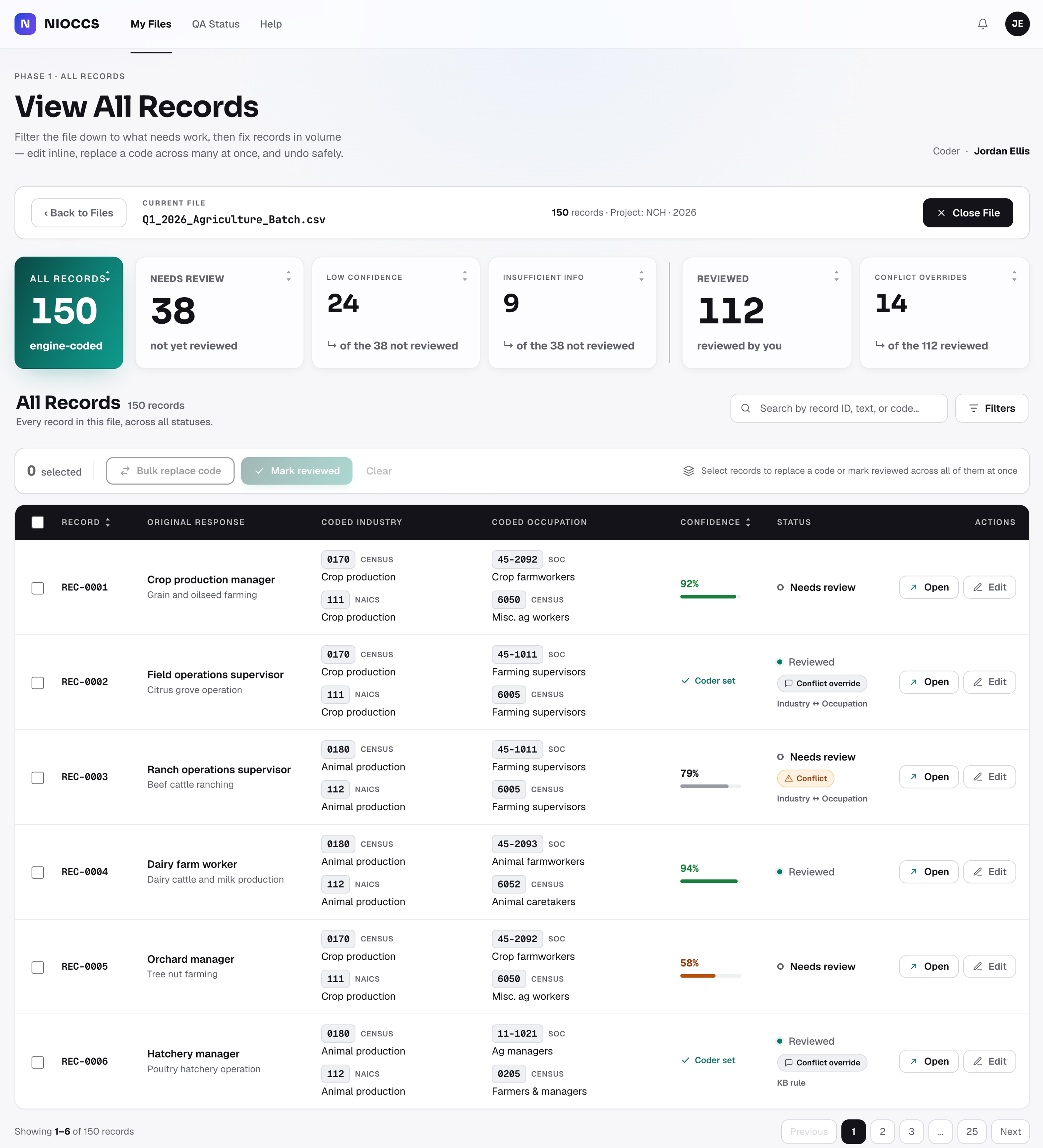
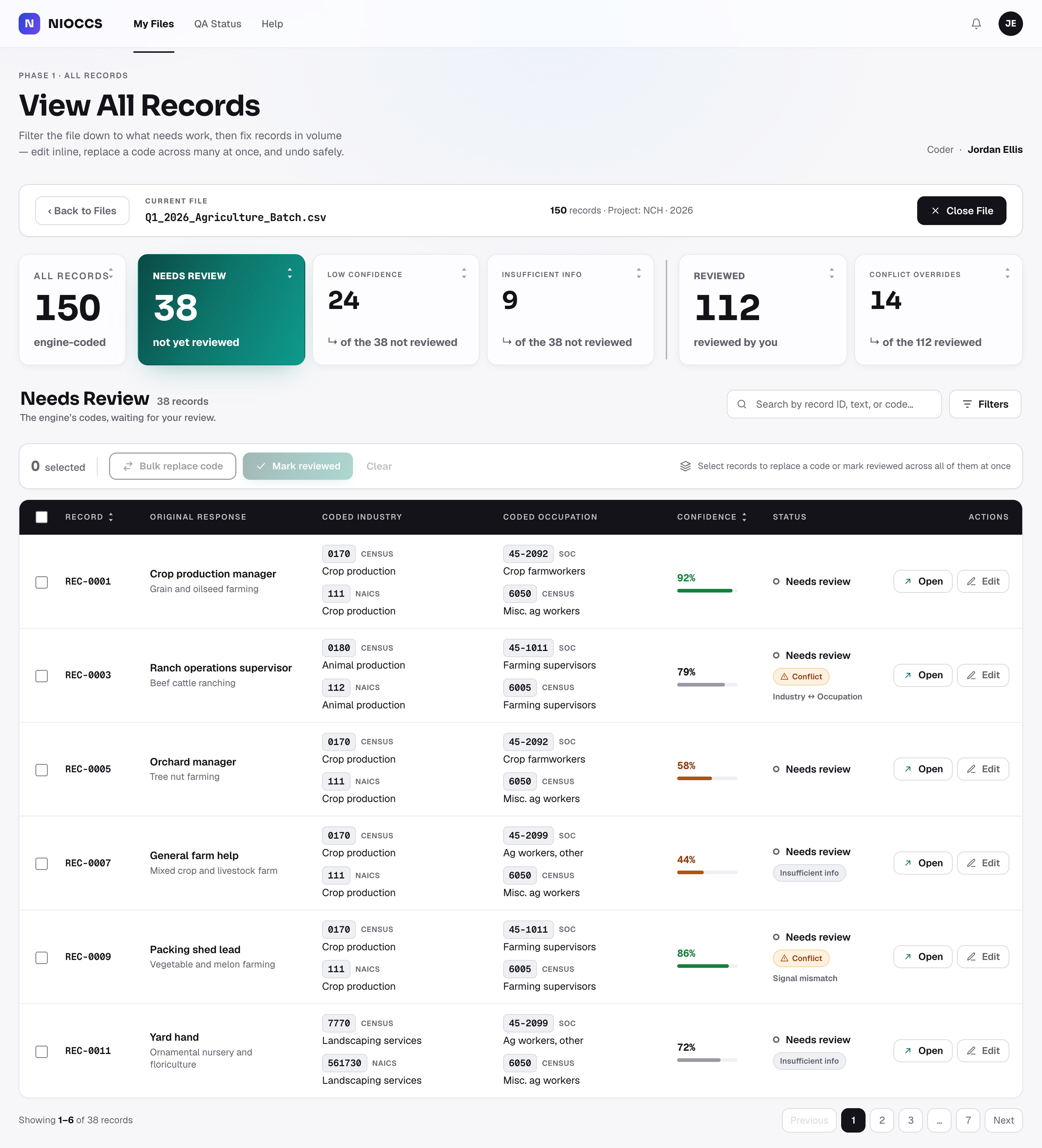
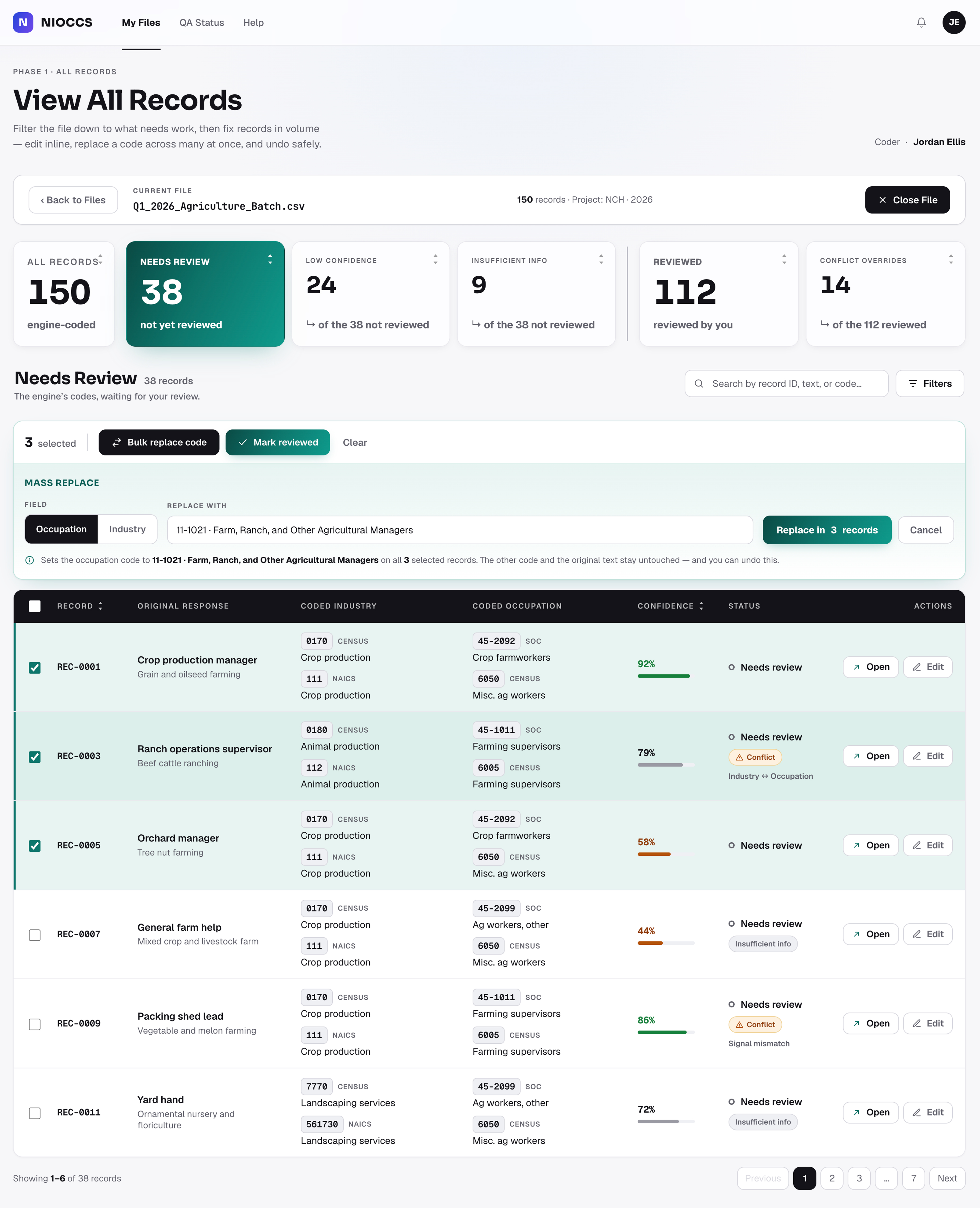
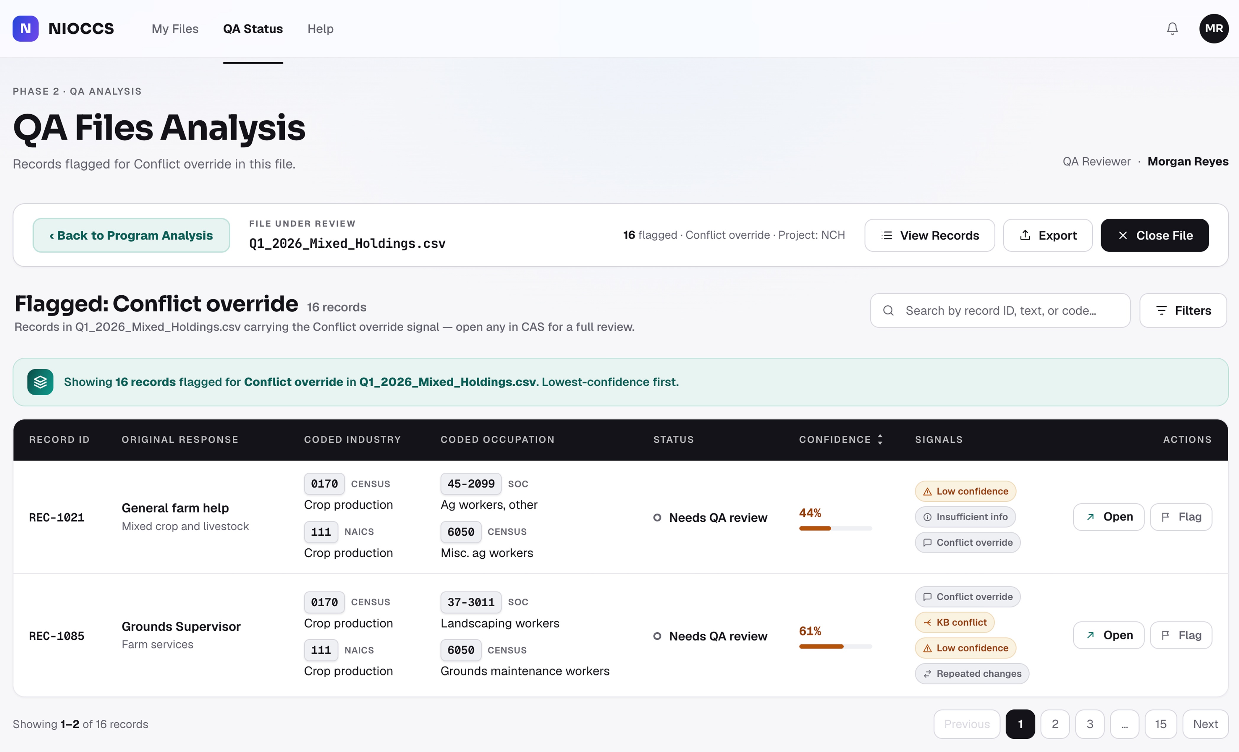
Shows how many records to review - and how to close the file.
Clearly shows the original input data.
Shows what the system autocoded, and the codes it chose.
Review controls are easy to find - revert or undo any change.
Clearly separates industry and occupation codes.
Suggested alternatives, each with a confidence score.